• Work
  • About
  • Contact
  • Resume
Ellyn Minnick
  • Work
  • About
  • Contact
  • Resume

cafe bustelo

For nearly 100 years, Cafe Bustelo has been celebrated as an expert gourmet espresso coffee brand with an unmistakable Latin flair. The JM Smuckers team partnered with Kaleidoscope, I led the strategic and creative exploration to honor this rich heritage while charting new territory for Bustelo Cool, their line of ready-to-drink cold beverages.

My charge was to honor the brand’s hard-earned visual equity while injecting a fresh, modern evolution into its traditional Latin aesthetic. Leading the conceptual development, I translated complex brand heritage into high-performing design systems. Two of my concepts advanced through rigorous qualitative testing, consistently ranking at the top with consumers, and ultimately secured spots as finalists in quantitative validation.

This project was a defining milestone in my career as a creative leader. It reinforced that true impact extends beyond final market selection – it’s about pushing boundaries, building consumer-validated design architecture, and driving creative vision under high-stakes corporate partnerships.

good measure

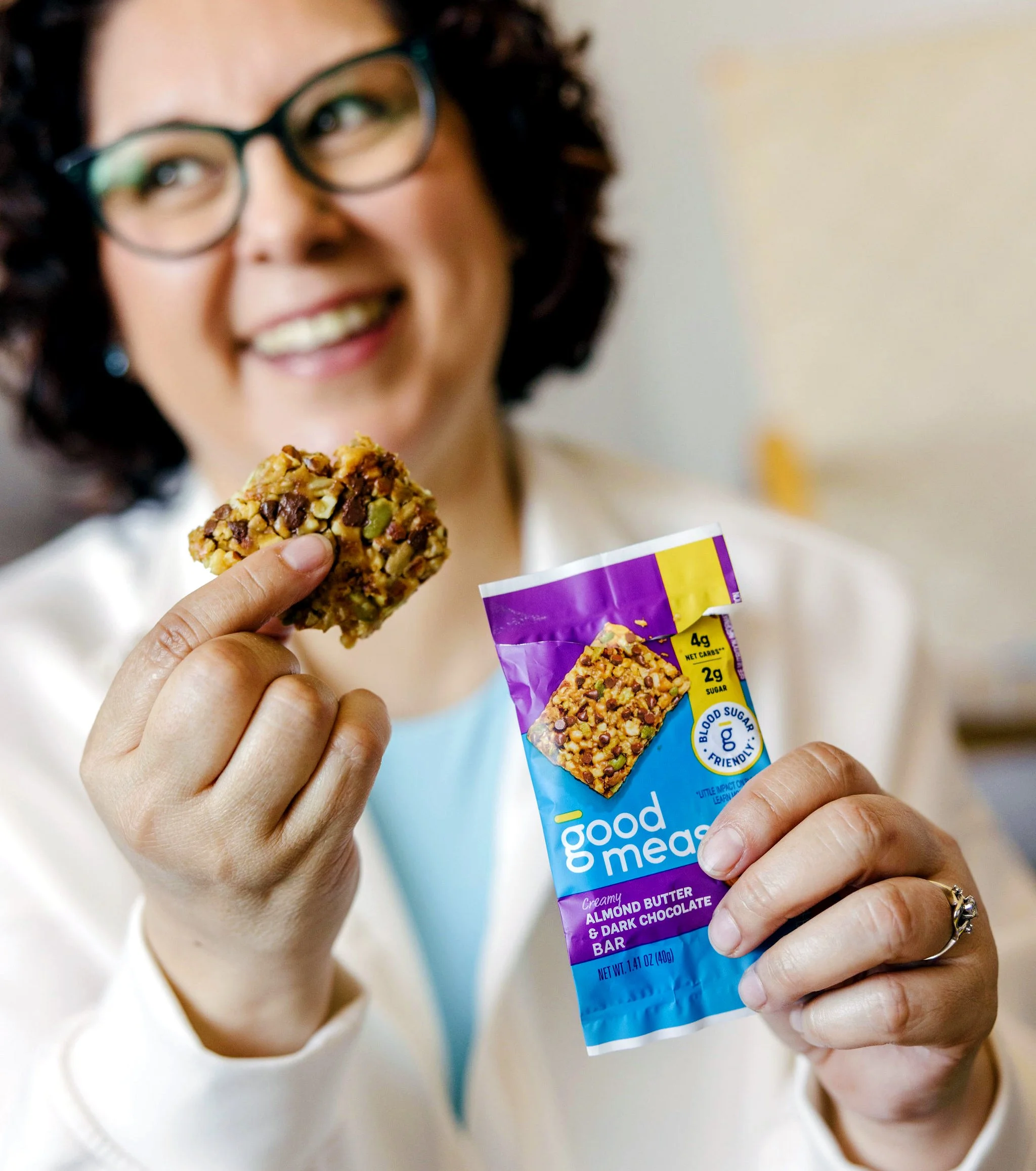
As Design Manager for Good Measure™ – a startup CPG brand housed within General Mills’ venture studio – I led the creative vision and packaging ecosystem to pioneer a new category of blood sugar-friendly foods. Tasked with establishing Good Measure as the definitive market leader for blood sugar-mindful consumers, I steered a comprehensive brand and packaging overhaul that fundamentally resolved a critical market visibility challenge.

Previously, the brand struggled with recognition because functional claims overshadowed the logo. Directing cross-functional stakeholders, agency partners, and consumer testing, I restructured the brand architecture to prioritize the proprietary brand equity while anchoring the “Blood Sugar-Friendly” claim as a secondary powerhouse driver. By spearheading a vibrant blue color palette, elevated logo hierarchy, and an intuitive macronutrient design corridor, the new packaging ecosystem dramatically simplified the shopper experience.

This strategic leadership directly transformed the brand’s market trajectory: testing showed exponentially improved shelf presence, a packaging redesign that doubled on-shelf brand recognition, a 100% increase in overall brand awareness, and a 22% surge in in-store growth. This project stands as a testament to my ability to translate ambiguous startup challenges into high-performing, scalable design systems that drive measurable commercial success.

blue buffalo life protection check

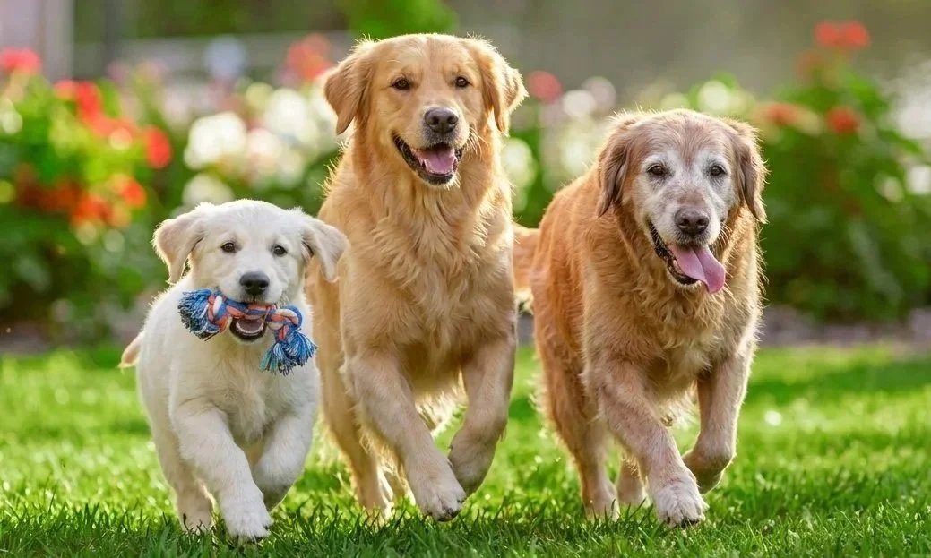
Blue Buffalo’s Life Protection Check campaign was developed to encourage pet parents to tailer their dog’s nutrition to their unique life stage and needs. While BLUE offers formulas customized for different ages, sizes, and lifestyles, many pet parents weren’t taking advantage of those benefits – for example, nearly 70% of senior dogs were not being fed senior-specific formulas despite their added nutritional support. The campaign empowered pet parents to make more informed feeding decisions by connecting each dog’s unique needs with the targeted benefits of BLUE Life Protection Formula, using educational content, compelling storytelling, and promotional offers to drive trial.

I established the comprehensive visual design that governed typography, color palettes, photography, composition, and messaging across every brand touchpoint. Translating intricate nutritional benefits into an intuitive, shopper-friendly narrative while strictly preserving Blue Buffalo’s core brand equity, I engineered a scalable creative toolkit. This robust system deployed seamlessly across a full-funnel media strategy spanning digital, social, retail, and owned channels.

Designed as a modular, flexible platform, the campaign successfully adapted across life stages and product lines – including senior, puppy, and small-breed formulations – while maintaining a rigorous, cohesive visual identity. Supported by this strategic design architecture, the campaign reached an estimated 685 million impressions and established an enduring platform extending into FY27, proving my ability to lead large-scale, high-visibility campaigns that deliver exceptional business performance.

coola

As a Design Director for COOLA, I spearheaded a comprehensive graphic and brand refresh in the spring of 2020 designed to elevate the brand beyond expected sunscreen clichés and anchor it firmly within the broader wellness and self-care space. Moving past traditional, beach-centric imagery, I led the visual strategy to build nuanced lifestyle applications that showcased the experiential qualities of the products and championed individual well-being under the campaign tagline “Start with You.”

Directing the digital marketing executions for the refresh, I engineered a strategic creative approach aimed at redefining the suncare category. By focusing on consumer education and bespoke lifestyle integration, my designs empowered audiences to navigate product benefits and discover tailored skincare solutions. This project cemented my ability to guide high-visibility brand evolutions, shifting tactical product promotion into an emotional, lifestyle-driven brand experience.

blue buffalo wilderness

As a creative leader for Blue Buffalo, I directed the omnichannel visual strategy across in-store retail, social media, digital advertising, and print collateral to reinforce the brand’s premier standing in natural pet nutrition. Operating within established brand architecture while continuously innovating creative delivery, I ensured that every consumer touchpoint effectively communicated the brand’s commitment to pet health and high-quality ingredients.

Whether architecting high-impact retail displays that educate shoppers at the point of purchase, engineering social media assets that drive community engagement, or guiding polished print campaigns for nationwide promotions, my focus centered on translating complex nutritional benefits into compelling visual systems. This body of work reflects my ability to maintain rigorous brand consistency while scaling creative solutions seamlessly across diverse physical and digital mediums to captivate and inspire brand trust.

folgers noir

Tasked by the JM Smucker Company to architect the future of Folgers in the ground coffee segment, the Kaleidoscope design team developed Folgers Noir, a strategic dark roast line designed to bridge the gap between mainstream accessibility and premium market positioning.

While preserving the foundational equity of the trademark Folgers logo and mountainscape, I led the creative exploration to deliver a modern, sophisticated interpretation. By integrating matte black packaging with subtle, premium color versioning, the design broke category conventions to achieve maximum shelf impact. This project demanded a sophisticated blend of design strategy and production expertise; by leveraging advanced printing techniques such as matte finishes and metallics, I successfully balanced high-end aesthetic vision with strict cost targets and manufacturing efficiencies.

Folgers Noir highlights my ability to direct complex packaging innovations that respect legacy brand equity while pushing a portfolio into exciting new market territory.

bare republic

When the COVID-19 pandemic triggered acute global shortages of essential hygiene staples in March 2020, Bare Republic – the sister brand to COOLA Suncare – faced an urgent mandate to pivot. Recognizing that outdoor adventure products had temporarily slowed, I helped lead the rapid, strategic realignment of resources, manufacturing, and creative execution to launch Bare Hands by Bare Republic, a new line addressing critical nationwide hand sanitizer shortages.

Tasked with bringing a brand-new sub-brand to market in record time, I directed the packaging design and visual architecture to bridge two worlds. The packaging integrated a cheeky, brand-aligned peace sign mark while utilizing typography, architecture, and composition that upheld the trusted, health-focused standards consumers expect from Bare Republic.

This project proved my ability to navigate high-ambiguity, fast-tracked environments, leading cross-functional pivots from suncare to essential goods, and delivering a retail-ready packaging system that successfully launched in mass and grocery channels nationwide.

fruto sparkling juice

When Arrow Juice, one of Saudi Arabia’s premier beverage producers, partnered with Kaleidoscope, I led the creative exploration for the logo redesign of their popular Fruto brand alongside complete packaging development for a brand-new sparkling juice line. Targeted at youth culture and trendy coffeehouses – the vibrant social epicenters of Saudi Arabia – the challenge was to engineer a fresh, highly aspirational product that consumers would proudly hold and display.

Drawing inspiration from sleek minimalism and modern architecture, I set out to design the “Apple” of the sparkling beverage category. While celebrating the natural fruit origin, I elevated the concept of “sparkling” by translating the illustrations into an abstract, effervescent visual style. By keeping the surrounding packaging architecture clean, quiet, and unfussy, I allowed the dynamic illustrations to take center stage, balancing cultural relevance with high-end global aesthetics.

This project highlights my ability to lead international brand evolutions, translate nuanced lifestyle insights into premium packaging systems, and create culturally resonant design frameworks for diverse global markets.

mars wrigley seasonal

At Kaleidoscope, I led strategic design initiatives across the Mars Wrigley seasonal business, steering the portfolio evolution for high-visibility holiday and seasonal windows. Developing packaging architecture for seasonal portfolios demands deep navigation of cultural semiotics, balancing distinct festive storytelling with instant brand recognition and repeat consumer purchase behavior.

One of my proudest leadership milestones was architecting the seasonal variety bag strategy across all four main selling seasons. I designed a bold, cohesive system built around character-driven storytelling and immersive seasonal scenes, establishing a visual framework centered on sparkle, surprise, and delight that allowed shoppers to instantly navigate the portfolio on shelf.

Managing a dynamic design system that flexes seamlessly across multiple distinct seasons has strengthened my ability to think at a macro level, balancing complex retail calendars with rigorous brand consistency and powerful commercial impact.

avon: be all

When Avon partnered with Coho Creative in early 2017 to reinvigorate its business model and capture an increasingly health-conscious consumer base, I led the creative and strategic development for Be All, a brand-new line of vitamins, supplements, and wellness products designed to modernize the portfolio.

Grounded in the core philosophy that beauty and physical well-being are intrinsically connected, I helped architect a brand built on the empowerment of all bodies. To bring this narrative to life, I directed the visual identity by juxtaposing clean typography with bespoke hand-lettering to infuse warmth and human personality into the brand. Across the packaging architecture, I engineered a sophisticated balance of crisp white space and vibrant, tactile textures that visually communicate product purity across a diverse SKU ecosystem.

This project highlights my ability to translate abstract brand values into high-performing retail systems, aligning purpose-driven design with strategic commercial execution to drive business relevance in the health and wellness sector.

us playing card: bldz

When the United States Playing Card Company (USPC) sought to expand into new categories with BLDZ, an innovative building toy combining illustrated cards and plastic connectors, Coho Creative was tapped to build the brand identity, breakthrough packaging graphics, and versatile structural design. Tasked with driving the strategic conceptual phase for the Space Explorers SKU, I engineered three distinct design systems that addressed unique brand attributes to help the client evaluate market priorities.

First, I designed a modular structural concept where individual SKUs interconnected seamlessly, deliberately engineered to drive consumer collectability and portfolio expansion. Second, I developed a dynamic, on-the-go-vinyl pouch adorned with custom illustrations, prioritizing active lifestyle mobility, storage versatility, and creative play. Finally, I architected a larger-than-life, fantastical cardboard packaging structure designed to maximize high-impact shelf presence and retail standout.

This multi-faceted exploration sharpened my mastery of 3D packaging structure, manufacturing feasibility, and strategic ideation, demonstrating my ability to guide cross-category innovation and help major brands define new product lines from the ground up.

huggies: project pearl

When Kimberly-Clark Vietnam partnered with Coho Creative in the spring of 2016 to reinvigorate their line of Huggies mid-level diaper pants, a popular hybrid category across Europe and Asia facing fierce competition from market leader Bobby-Chan, I led the creative exploration to overhaul the portfolio. The mandate was clear: overcome dated, confusing visuals by designing packaging that overtly differentiated the front from the back, integrated the non-licensed character Finley Bear, and achieved a bold, colorful, and active aesthetic engineered to outperform the competition in consumer testing.

To solve this, I developed Urban Playground, a strategic design concept that tapped directly into the highly relevant anime trend across Asian markets. I gave Finley Bear a modern anime-inspired makeover and surrounded him with clean, geometric illustrations rooted in contemporary Asian pop culture. To solve the functional usability challenge, I integrated intuitive garment cues into the waistband, including the word “sau” (Vietnamese for back) and a tie-front graphic, ensuring effortless navigation for parents.

Although another route was ultimately selected for market, Urban Playground emerged as a standout favorite among both the client and internal teams, and successfully outperformed Bobby pants in rigorous consumer testing. This project served as a pivotal turning point in my creative career, igniting my passion for illustration and sharpening my ability to translate complex cultural insights into high-performing international packaging systems.

coho creative rebrand

When Cincinnati-based brand strategy, innovation, and design agency Coho Creative sought to modernize its own visual identity, leadership invited the team of designers to submit provocative, forward-thinking brand concepts that captured the agency’s distinctive market positioning. Out of numerous submissions, the partners selected my concept to spearhead Coho’s brand evolution.

The redesigned visual identity was engineered to articulate the unique duality that defines Coho: the rigorous precision and strategic caliber of a major consultancy combined with the agility, warmth, and personal touch of a boutique firm. To bring this balance to life, I designed a precise, structured letterform and enclosing geometric border that spoke to corporate expertise, while introducing a vibrant blue “O” and a purposeful curved corner on the bounding box to inject creative fluidity and humanity.

Centered around Coho’s core value of continuous betterment – and supporting a mission of partnering with responsible brands and community-driven initiatives like “Cohope”, every element of the new brand architecture was anchored by a single guiding philosophy: “what if?” This project demonstrated my ability to translate complex corporate positioning and agency ethos into an iconic, memorable brand identity.

meijer: refrigerated juice blends

When regional giant Meijer tasked Coho Creative with a comprehensive redesign of their popular Tropical Blends juice line, the primary objective was to resolve widespread consumer confusion caused by vague naming conventions and re-establish clarity across the portfolio. To ensure shoppers could instantly understand the product offering and flavor profiles, I spearheaded the creative redesign that was ultimately selected out of all agency concepts to roll out across Meijer’s 200 nationwide stores.

Because the previous packaging lacked clear product differentiation, I re-architected the visual hierarchy to prioritize distinct flavor versioning over the sub-brand name. I engineered vibrant, fruit-forward imagery that vividly communicated freshness and mouthwatering taste while providing an intuitive, unmistakable coding system across all four flavors.

This project successfully transformed consumer navigation at shelf, drove national retail impact, and was recognized with a 2016 GDUSA Award for outstanding package design by Graphic Design USA, underscoring my ability to solve complex legibility challenges and deliver award-winning commercial packaging.

cafe bustelo

— view —

80555 SM R1 CafeBustelo TerritoriesPosters_FEATIM.jpg

good measure

— view —

2024_03_Stone_TopSelects_Still_Web_7 copy.jpg

blue buffalo life protection check

— view —

Firefly_Gemini-Flash_Show-a-pack-of-3-dogs-running-together.-One-is-a-puppy,-one-is-an-adult-dog,-and-one--97746.jpg

coola

— view —

coola_featim-01.jpg

blue buffalo wilderness

— view —

24-300-1155-CDN_PSM_WLD_DualSpeciesCreative_BannerSizes_Opt1_121124_EM-05.jpg

folgers noir

— view —

SMU 81864 FolgersNoir Logos_Assets_smoky midnight_featim.png

bare republic

— view —

bare hands featim copy.jpg

fruto sparkling juice

— view —

Fruto_FeaturedImage-01.jpg

mars wrigley seasonal

— view —

SeasonalVarietyBags-featim.jpg

avon: be all

— view —

BeAllFeatIm-01.jpg

us playing card: bldz

— view —

BLDZDoodleFeatIm_040219-01.jpg

huggies: project pearl

— view —

PearlFeatIm-01.jpg

coho creative rebrand

— view —

CohoLogo-01.jpg

meijer: refrigerated juice blends

— view —

RefrigeratedJuiceBlendsFeatIm.jpg

© 2026 ellyn minnick. all rights reserved.