Designing within a brand – and knowing when to push it.
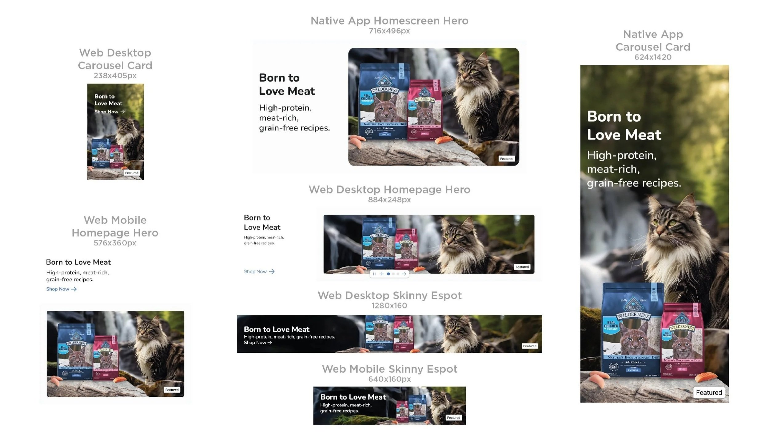
My work with Blue Buffalo has spanned retail, e-commerce, digital, print, promotions, and more – often translating established campaign systems into the specific constraints of a new channel, retailer, or brief.
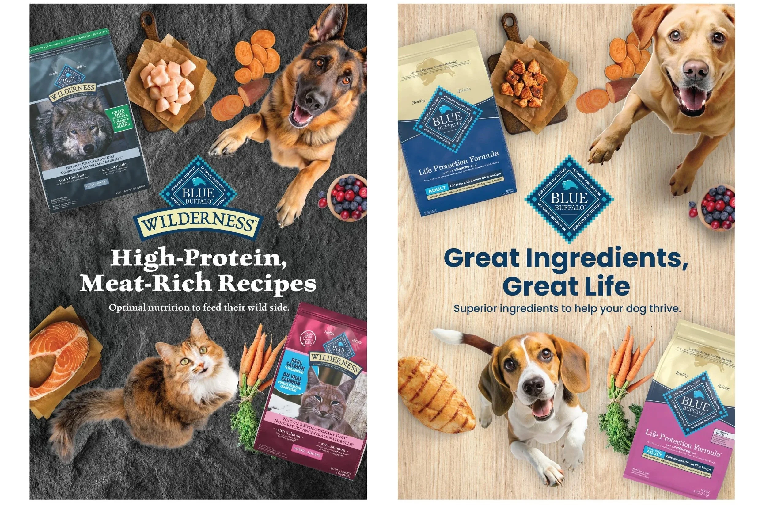
For PetSmart Canada, the ask was different. Existing executions were beginning to feel familiar, and the retailer wanted a fresh visual interpretation of BLUE’s established look and feel. I developed a new key visual using a bird’s-eye perspective, tactile surfaces inspired by different food lines, and pets interacting directly with ingredients and product.
The direction launched at PetSmart Canada and later influenced new BLUE executions in the US beyond the original retailer.
Designing for the physical shelf.
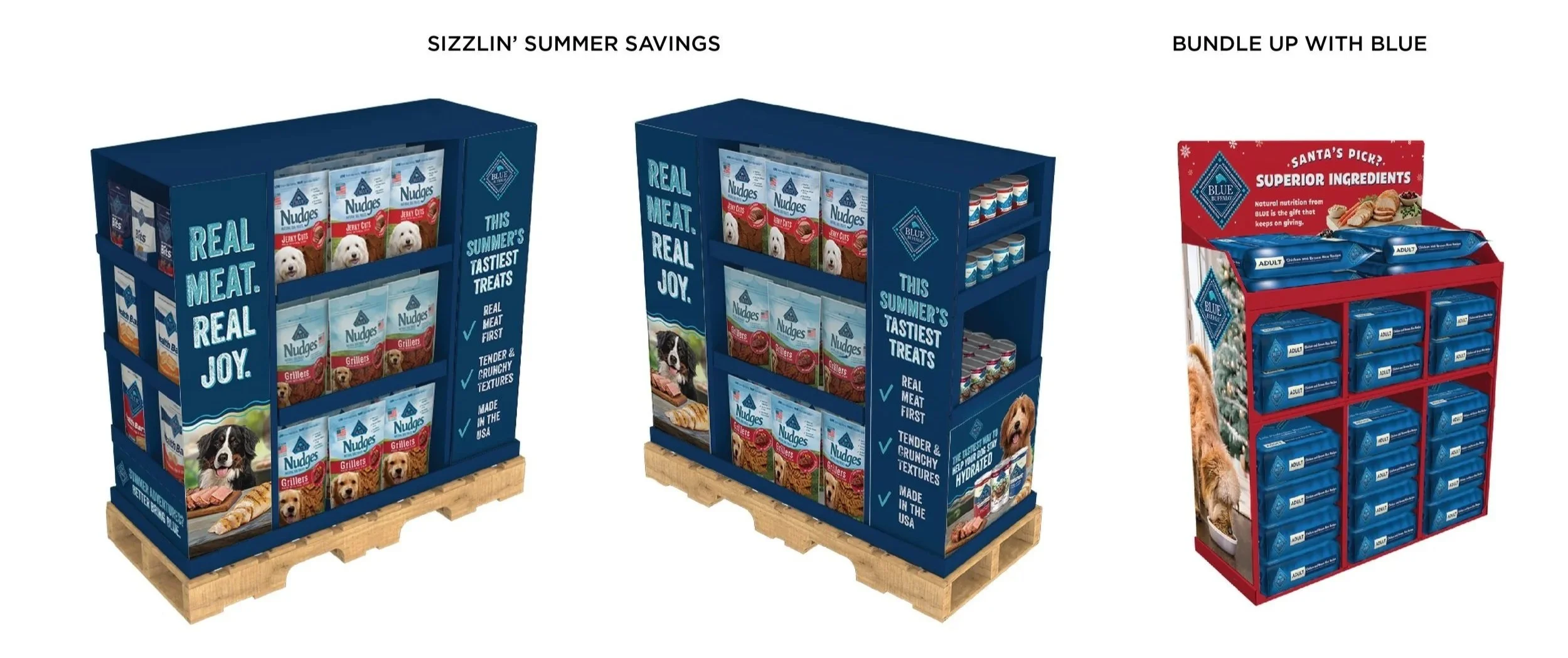
Retail brought a different set of constraints. Working from supplied structures, I designed directly on dielines, adapting established campaign creative to work across multiple panels, viewing angles, and product configurations.
I carried each display through final production, preparing print-ready artwork and working within the realities of the physical structure without losing the hierarchy or impact of the original campaign.
Making the product story easier to understand.
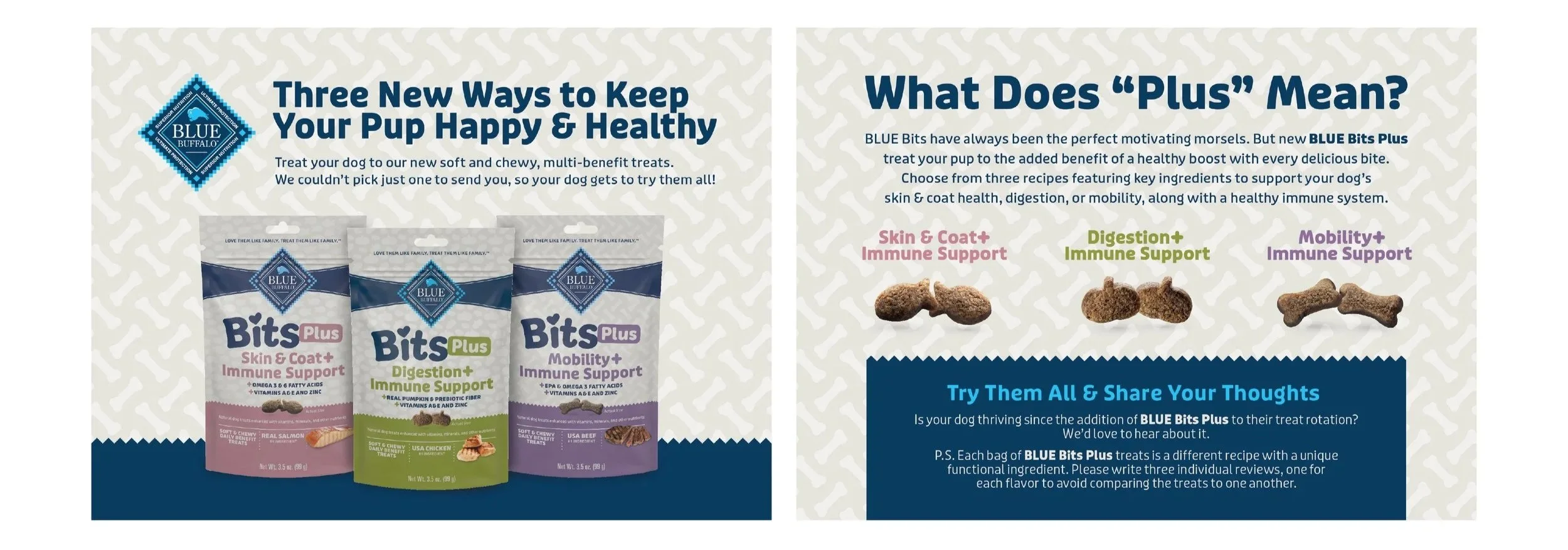
For BLUE Bits Plus, the challenge was explaining what made the new line different from everyday BLUE Bits – and giving each functional benefit enough room to register.
Starting with the brief, I determined what information needed to lead on each panel and what could become supporting detail. The design leaned more heavily into the Bits Plus packaging to distinguish the new line while still feeling unmistakably BLUE.
Making the system work at every size.
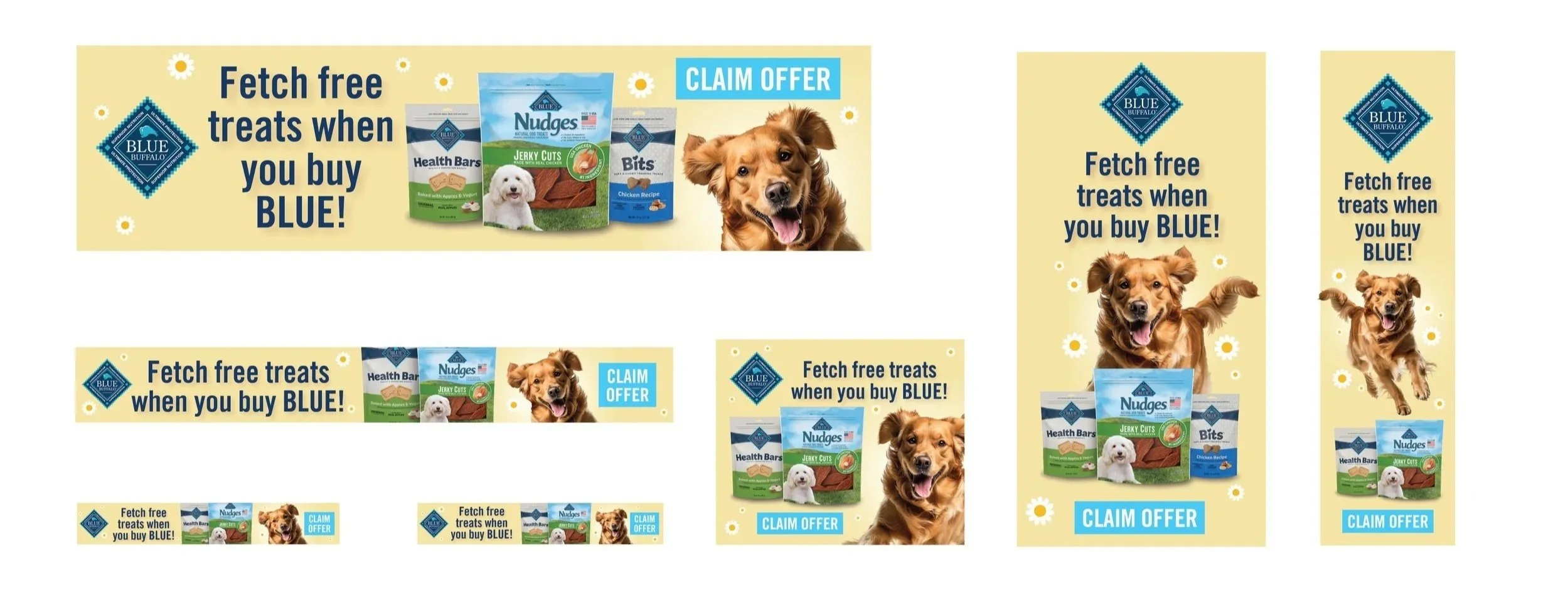
Digital placements often came with very different rules. For retailer media like Kroger, I worked within tightly defined templates and specifications. Other projects offered more flexibility, but still had to hold together across everything from wide banners to narrow vertical placements.
In each case, the challenge was deciding how logo, message, product, imagery, and CTA should scale and shift while keeping the hierarchy clear – even when the available space changed dramatically.