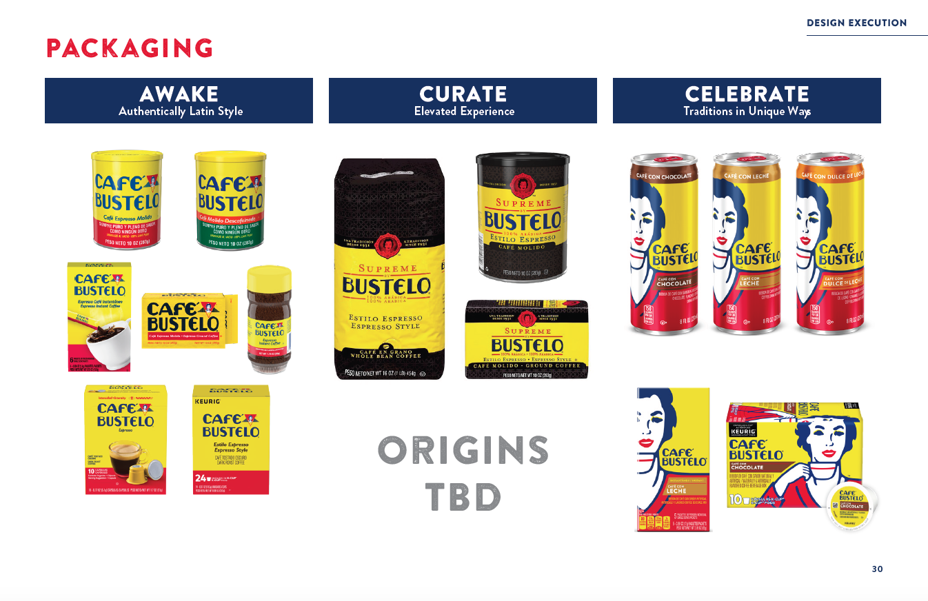
Bringing a heritage brand somewhere new.
Café Bustelo was expanding beyond the coffee aisle and into ready-to-drink beverages. The challenge was to make the new line feel fresh and relevant for a different category without designing away the character that made Bustelo distinctive in the first place.
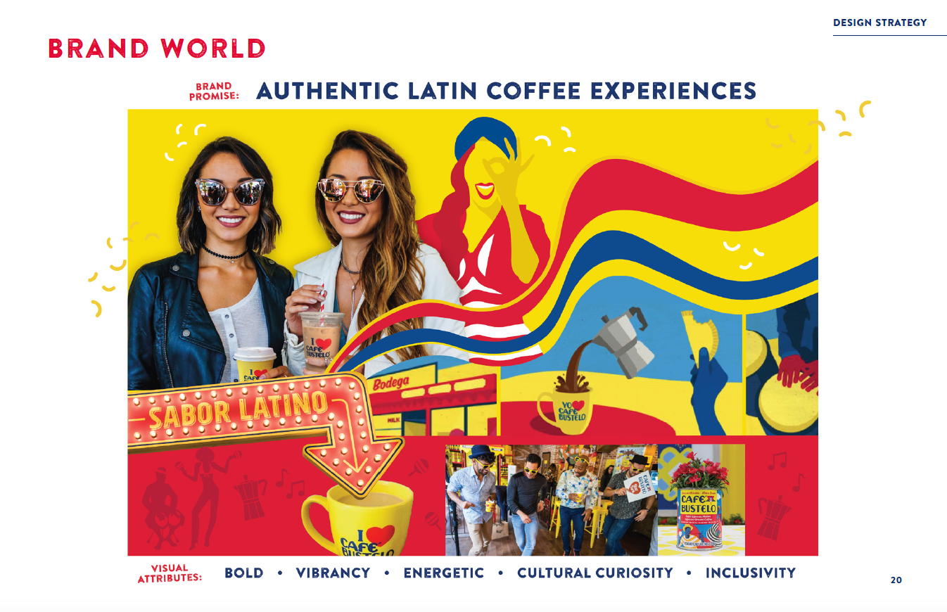
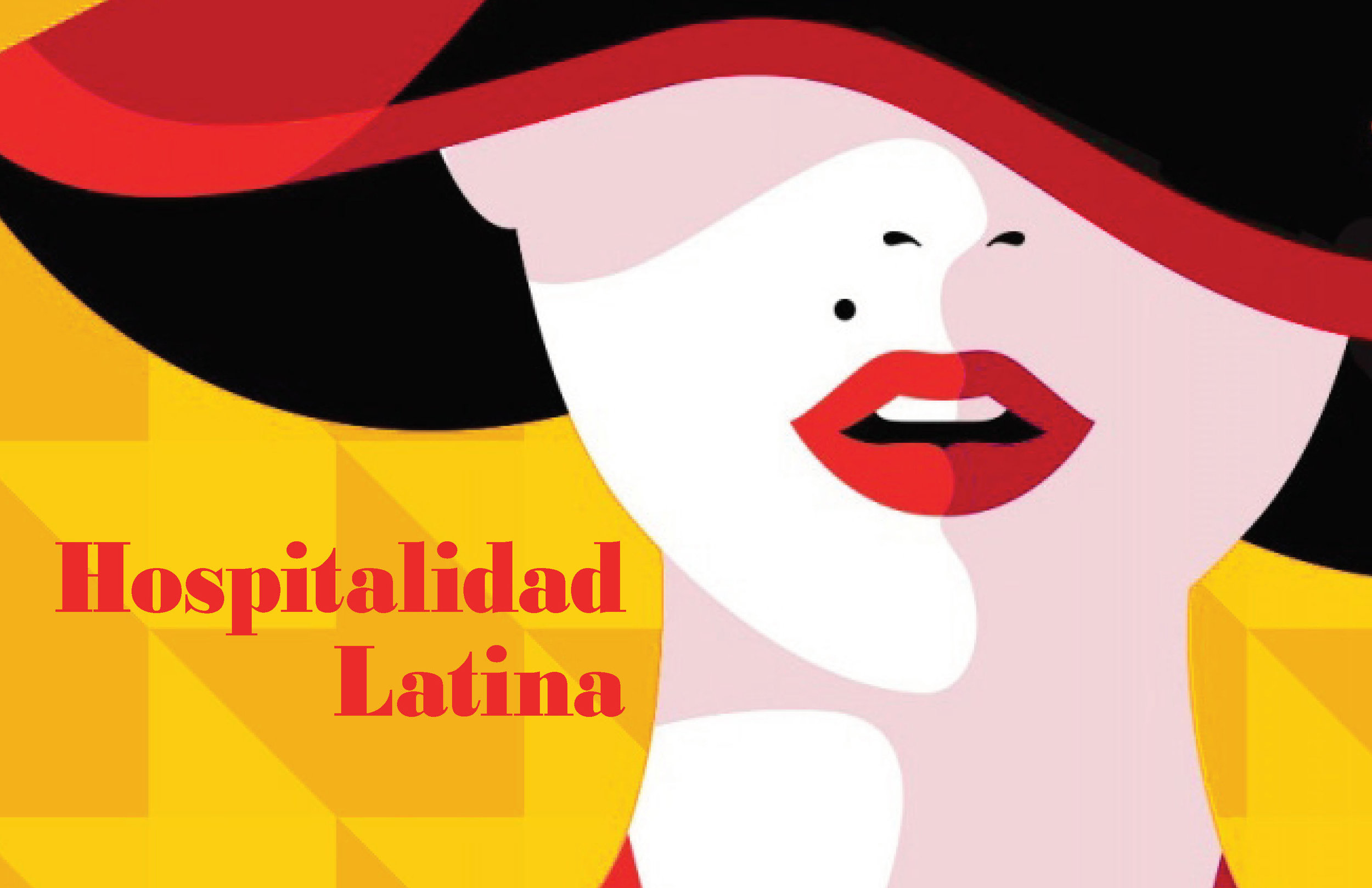
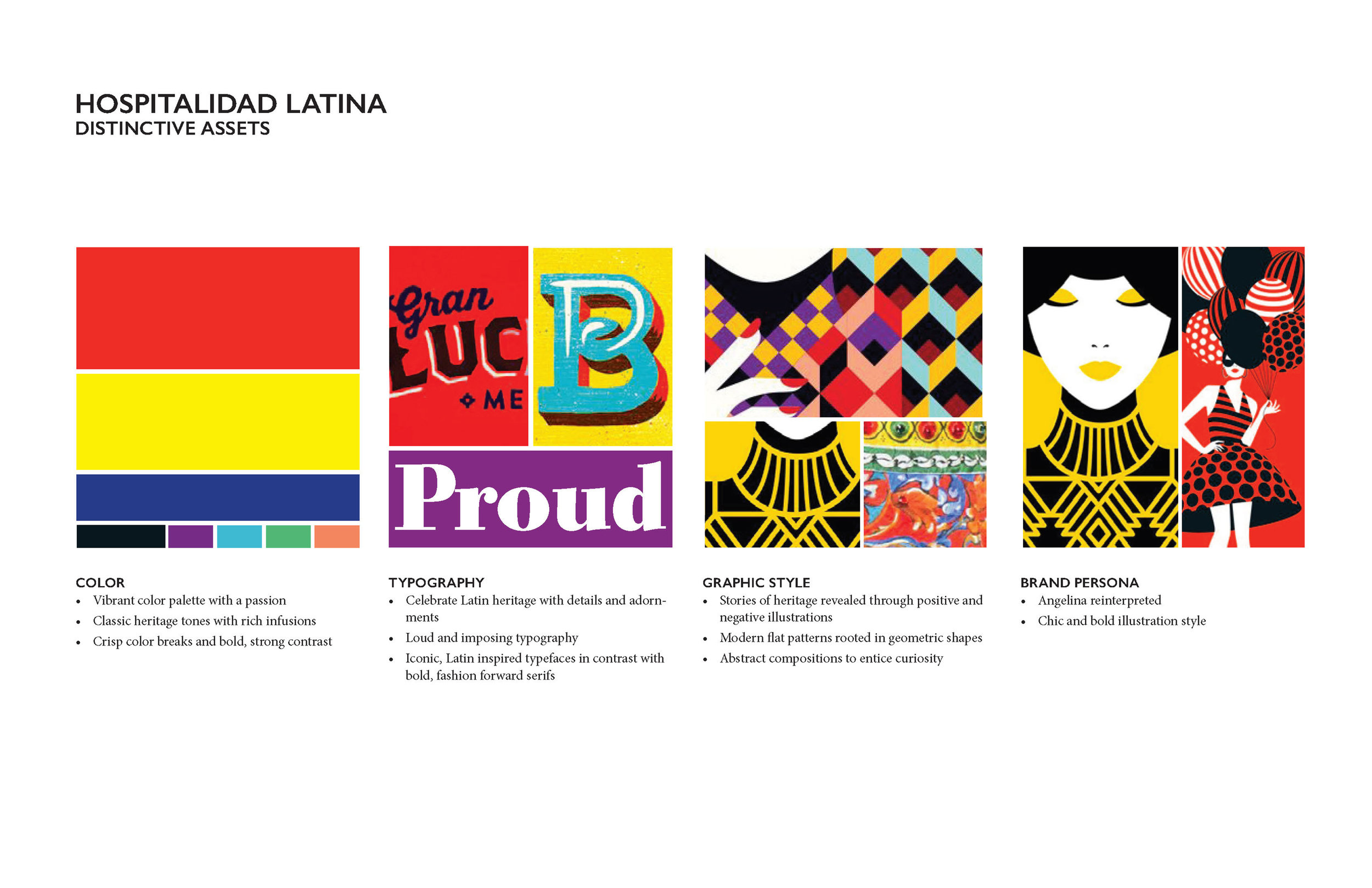
Its Latin flair wasn’t something to modernize out of the brand – it was part of what made Bustelo resonate with a younger, creative audience. The opportunity was to find a new expression of that heritage.
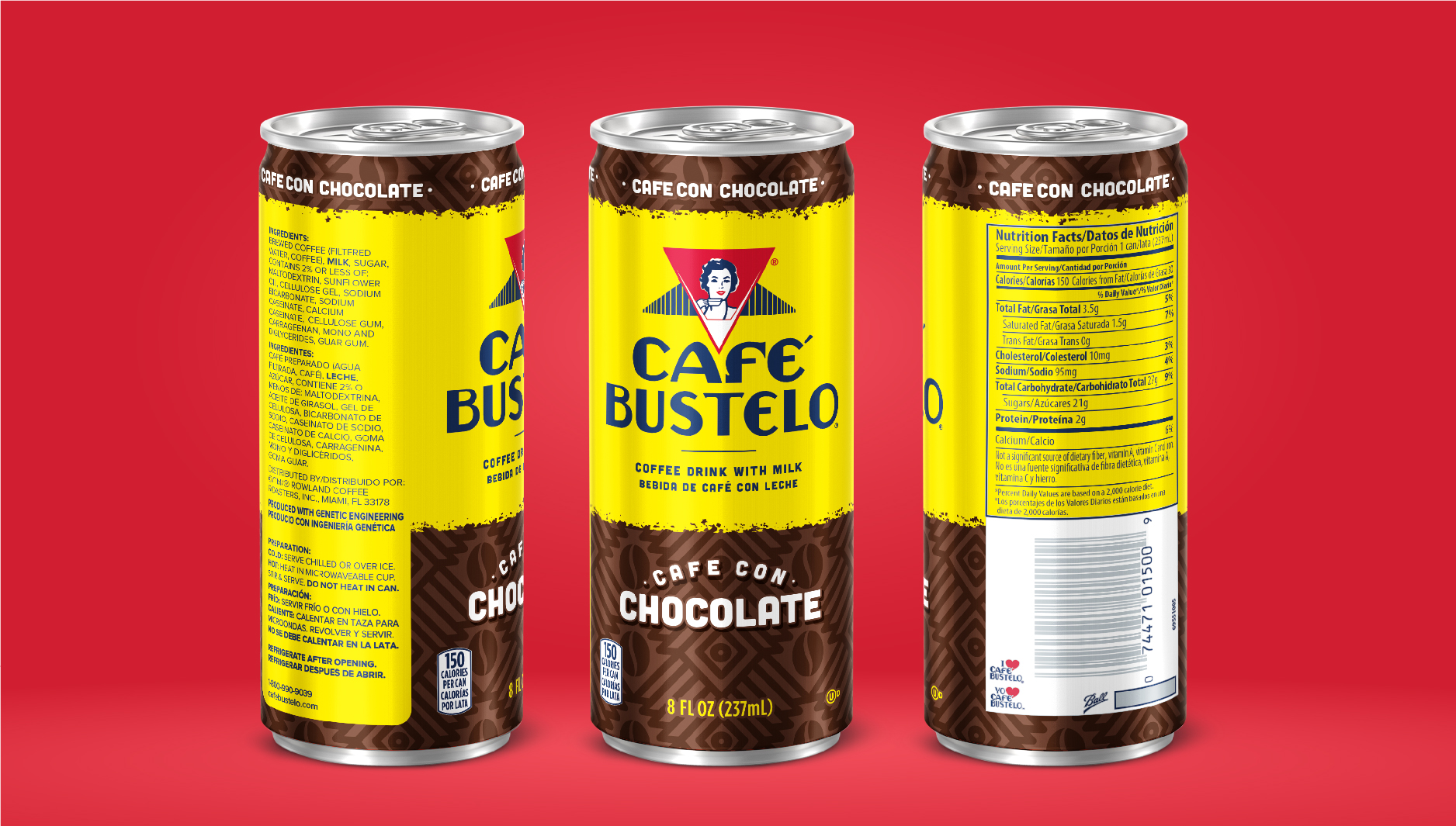
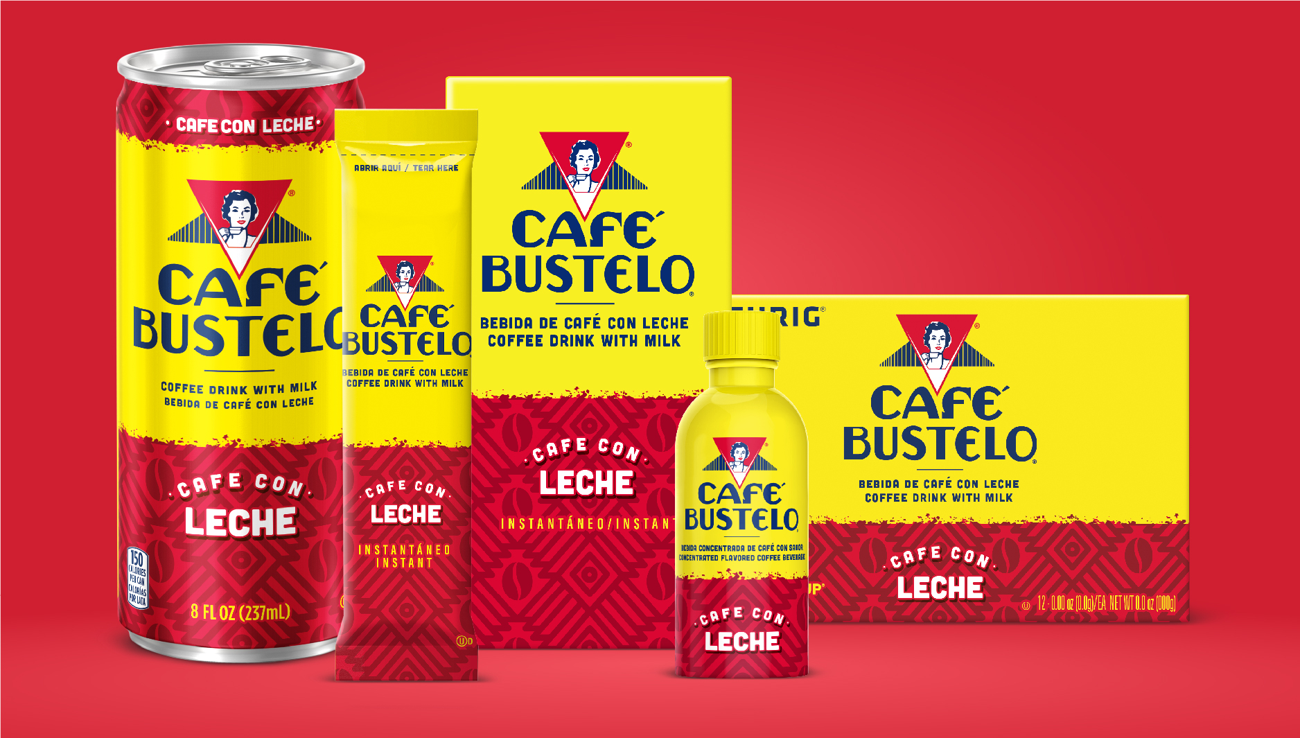
How far could Bustelo stretch?
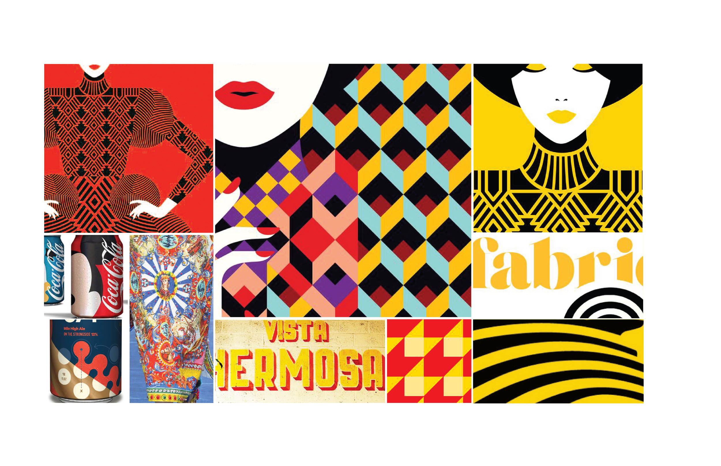
Working alongside the project’s Associate Creative Director, I developed packaging concepts that explored different relationships between Bustelo’s established equities. Yellow remained the anchor, while each route pushed and pulled on elements like Lady Bustelo, the iconic wordmark, and expressions of the brand’s Latin heritage.
Two of the three concepts selected for qualitative consumer testing were my original directions. Both performed strongly with consumers and advanced into quantitative validation.
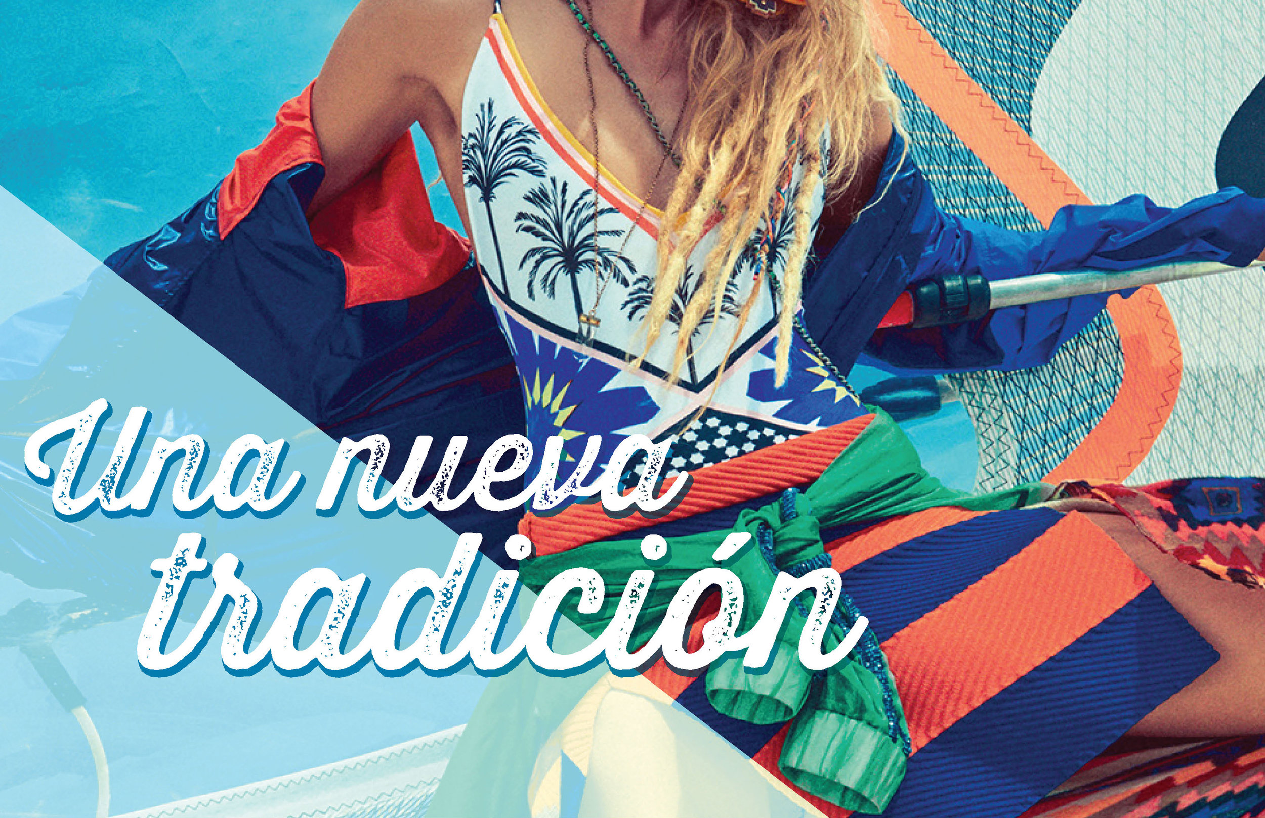
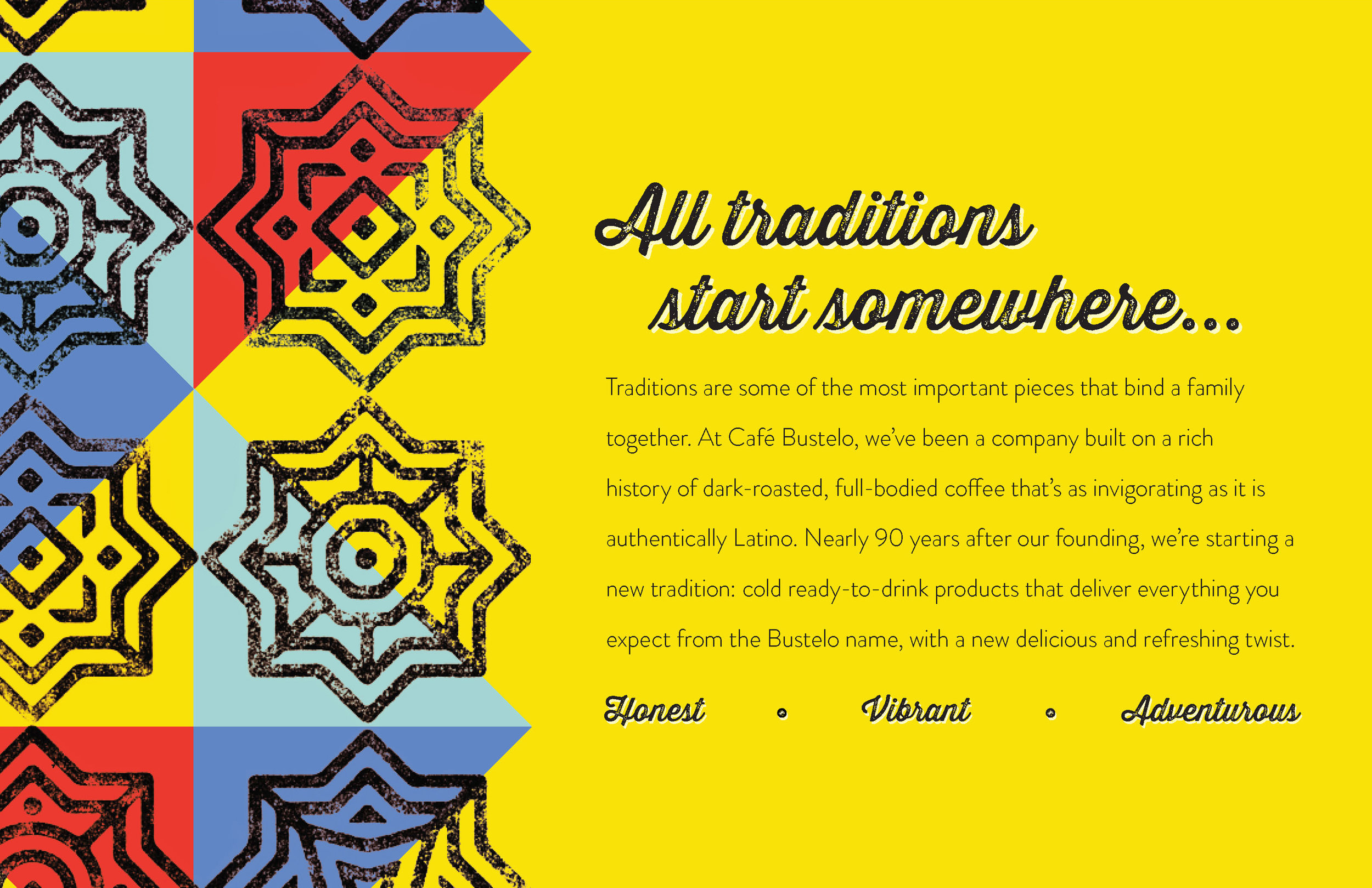
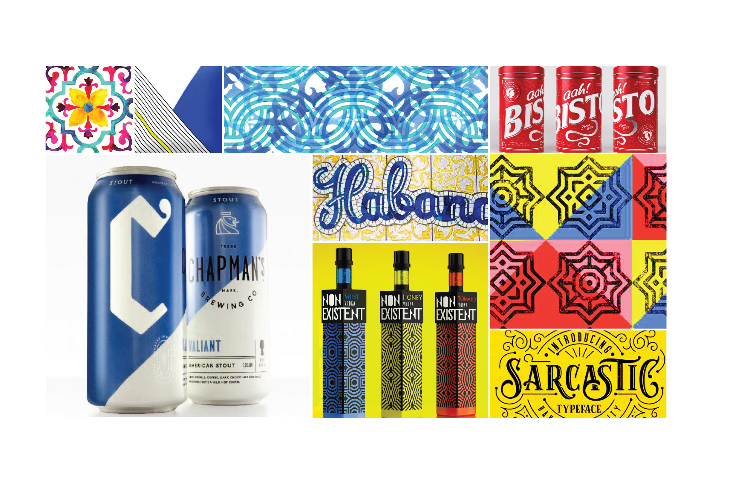
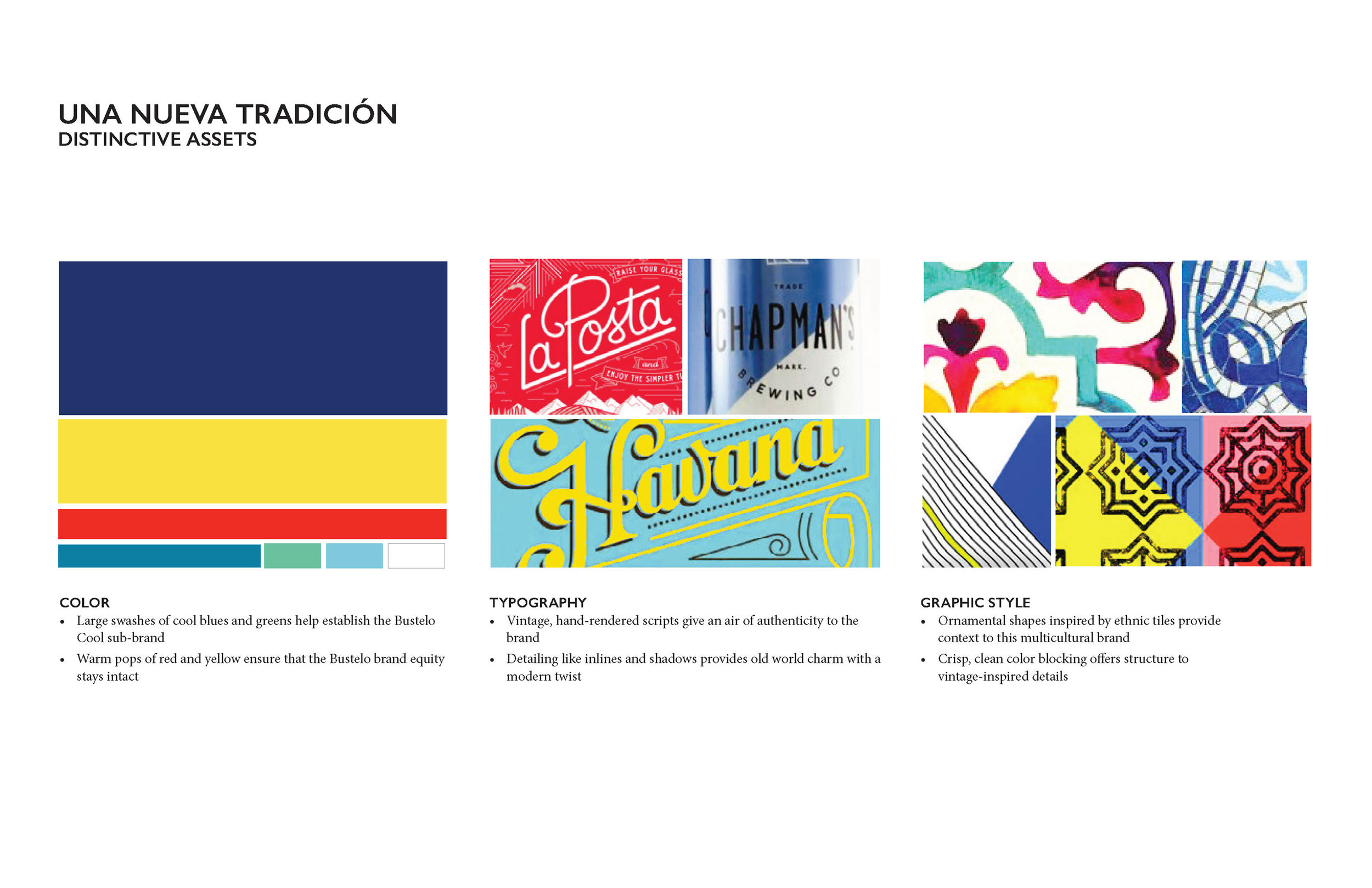
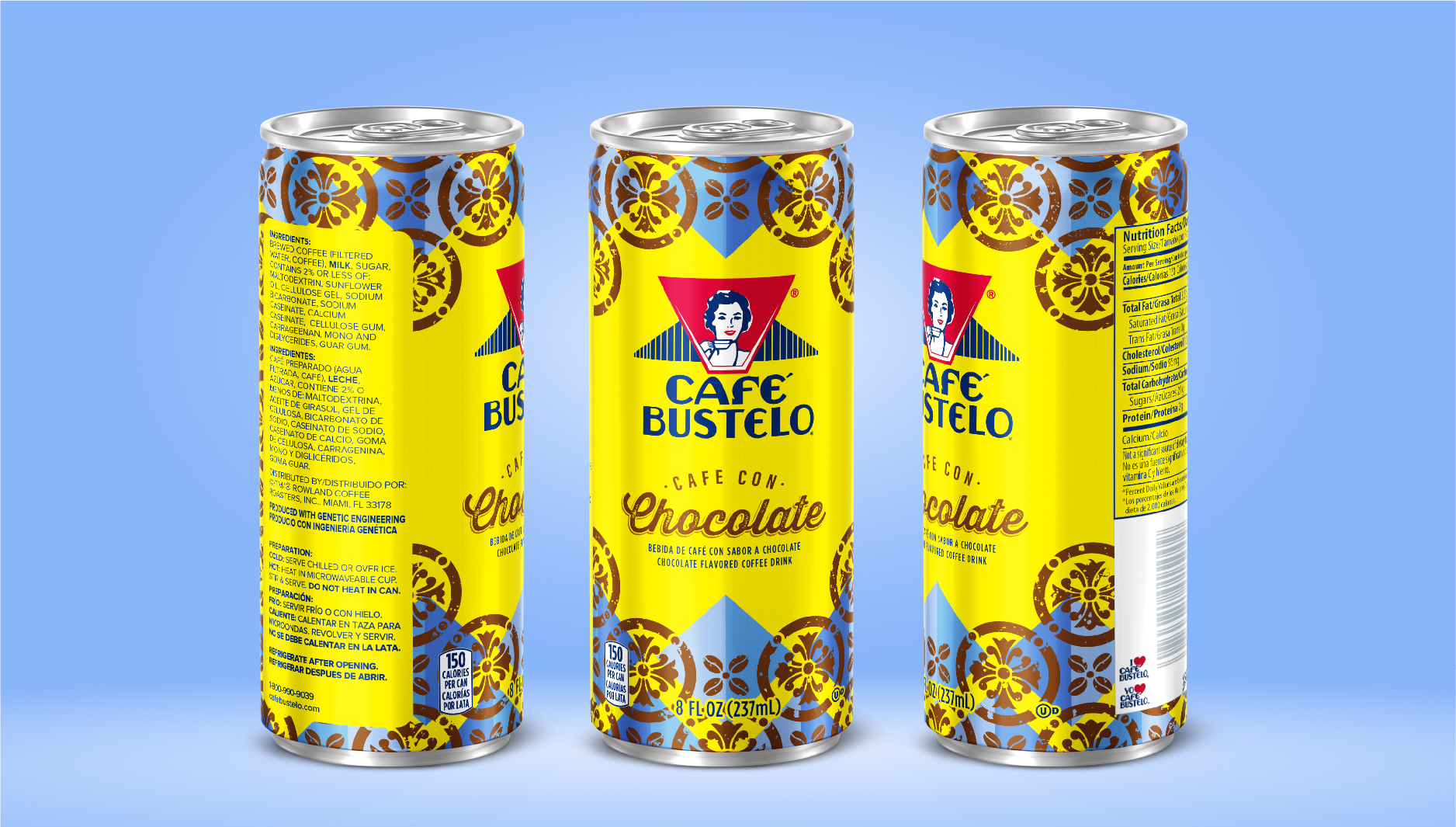
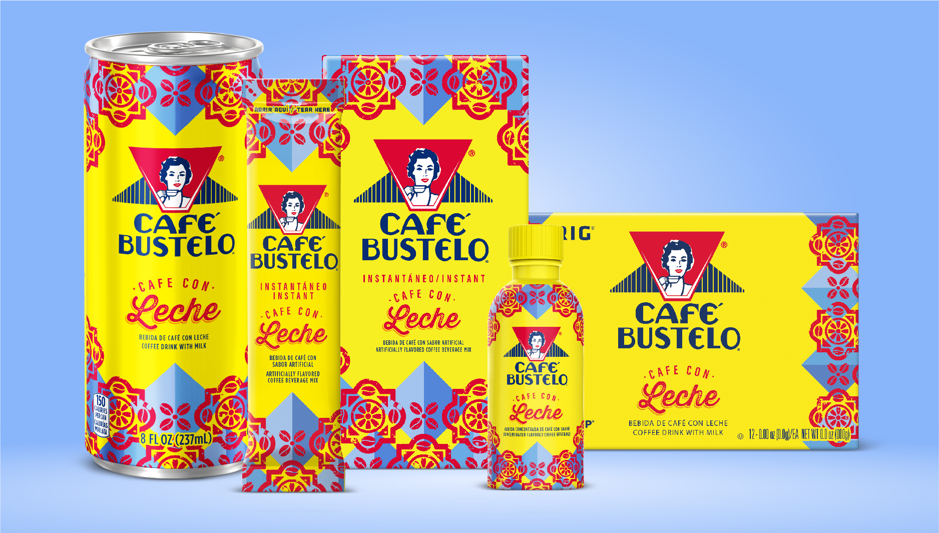
From exploration to a system.
Another route was ultimately selected for production. I stayed with the project through its next phase, taking point on production and extending the chosen design into a broader brand system.
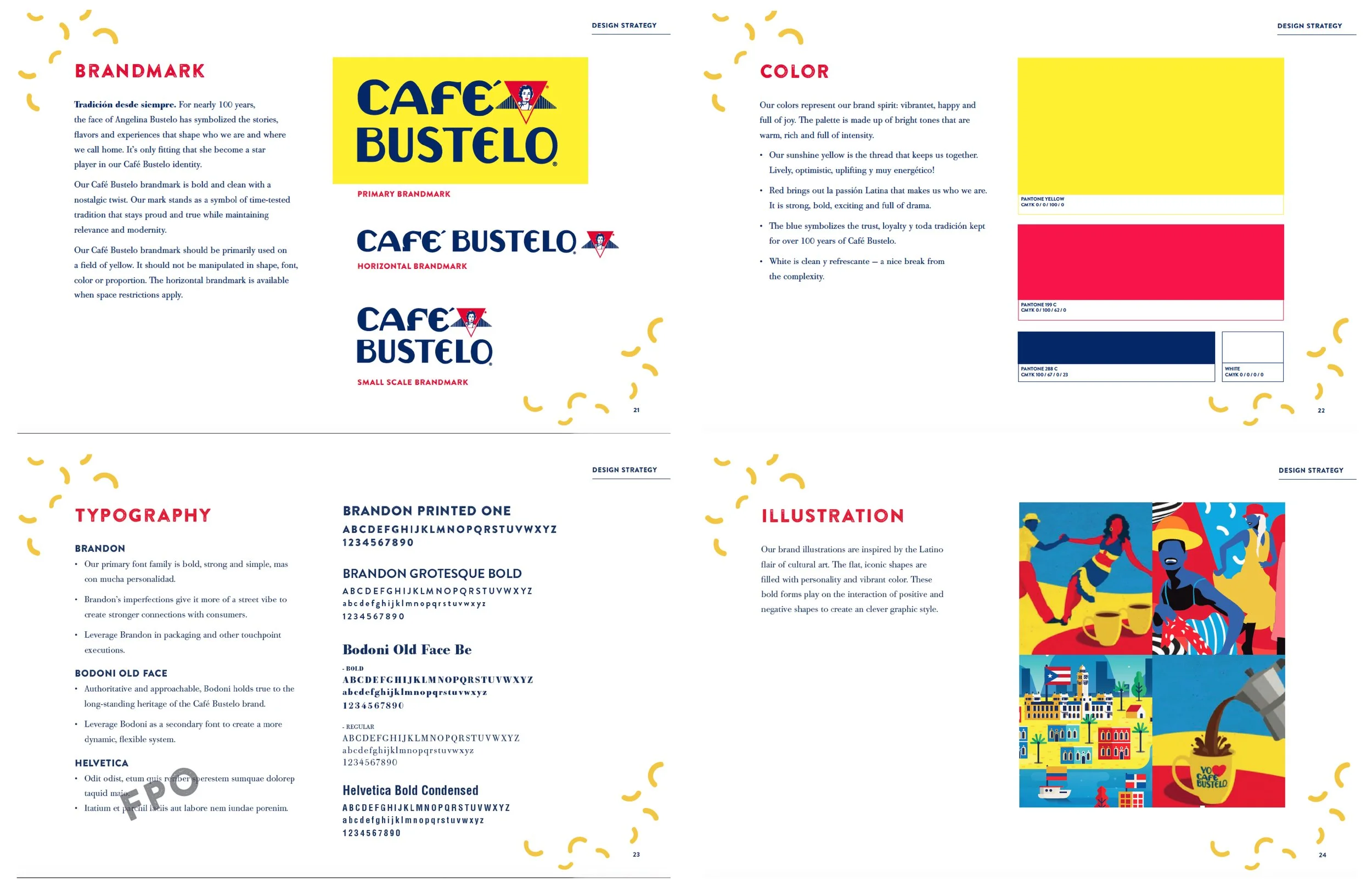
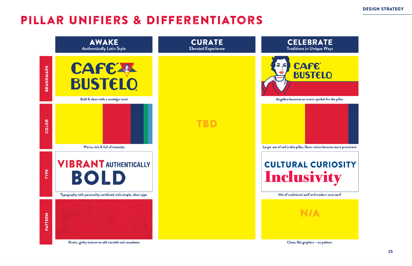
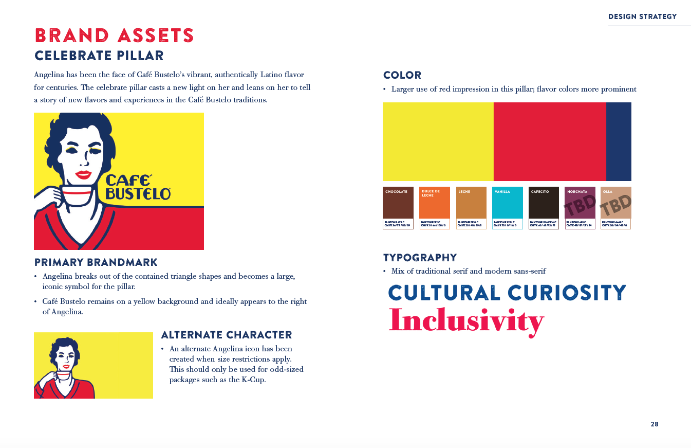
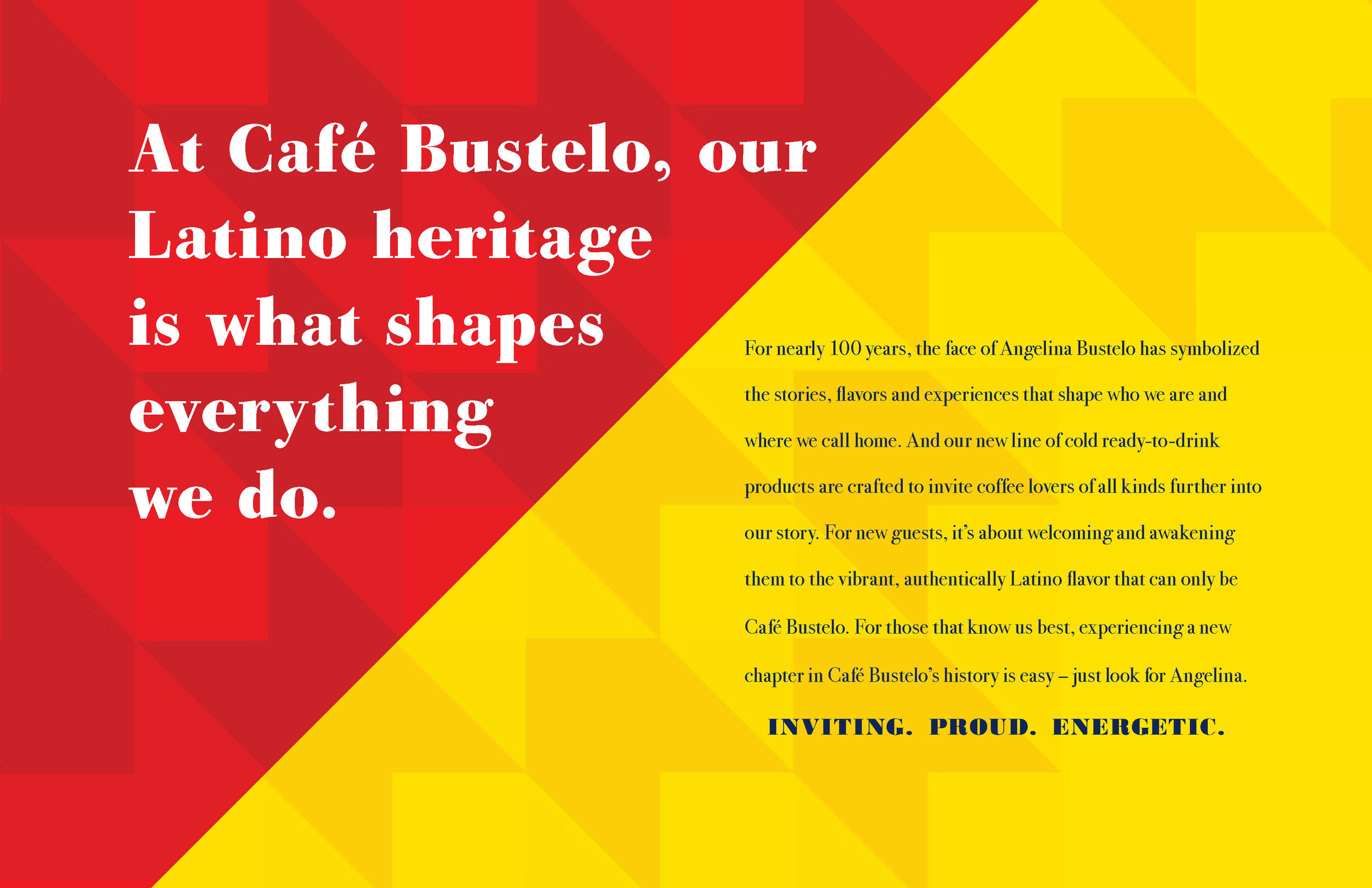
I developed a brand book to codify the chosen direction across packaging and brand expression, creating the tools needed to carry it consistently into the world.