
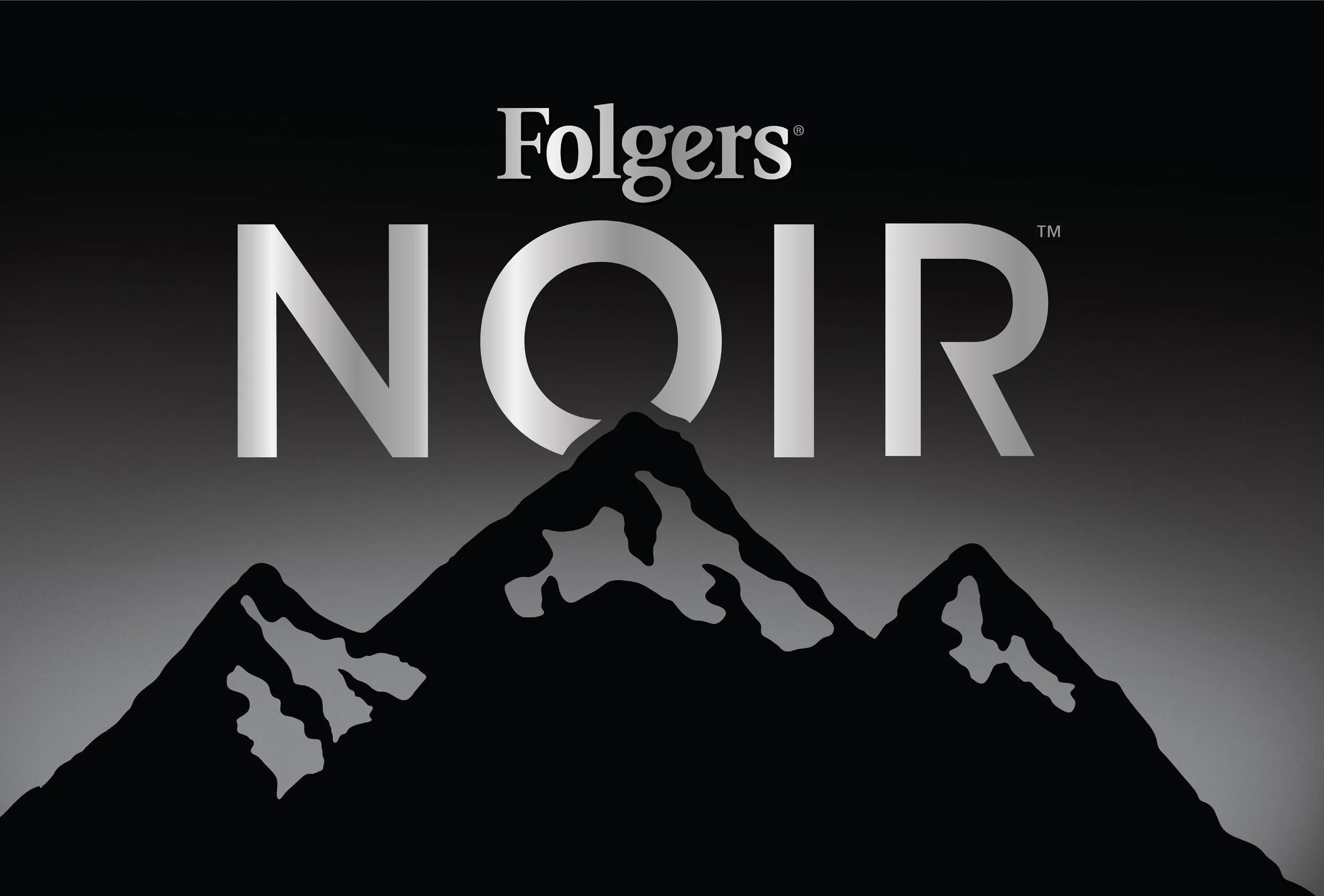
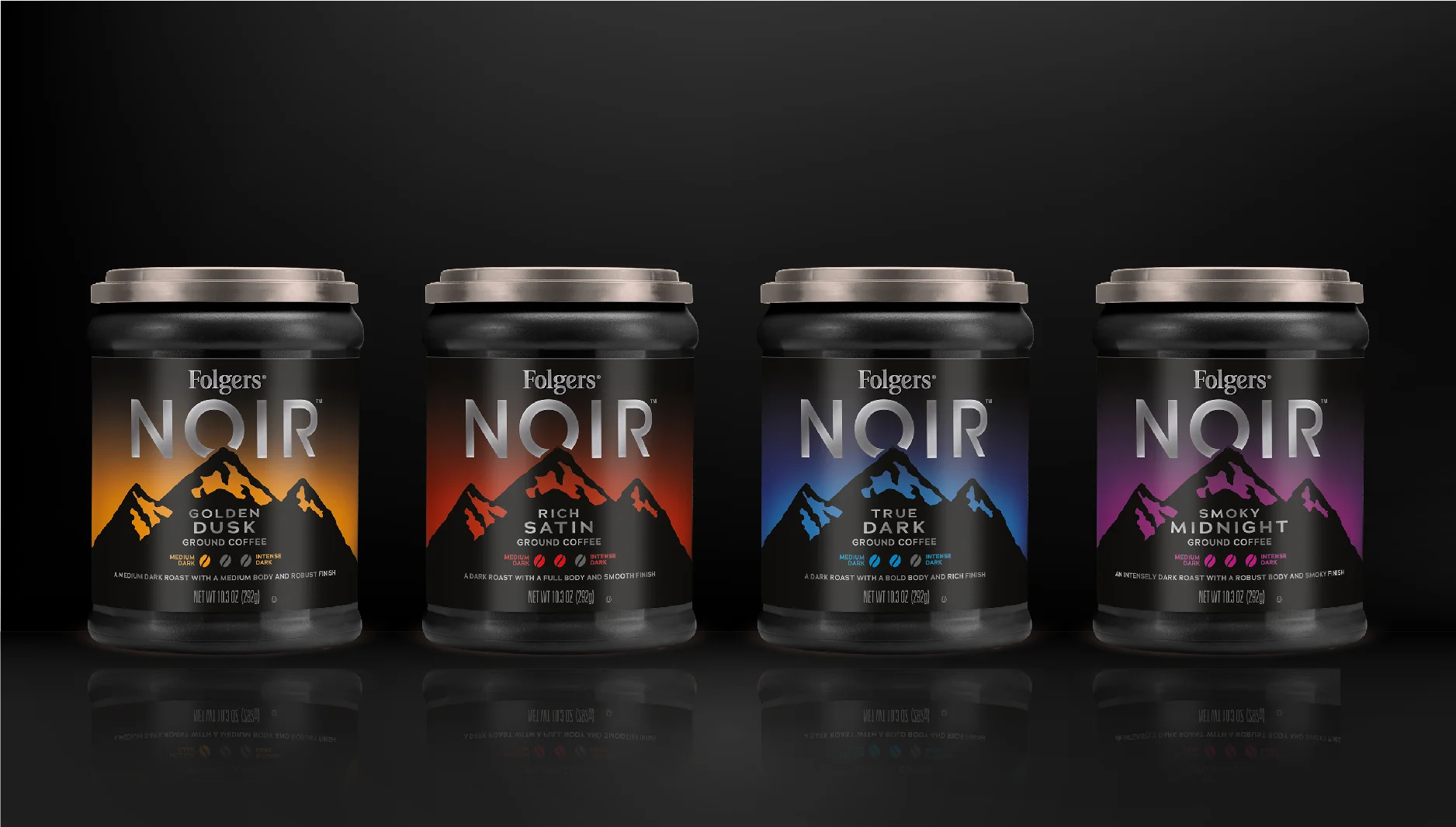
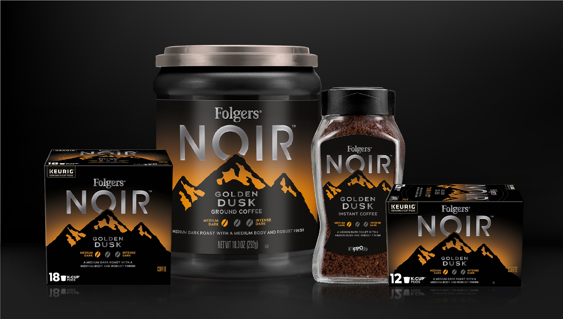
Tasked by the JM Smucker Company to architect the future of Folgers in the ground coffee segment, the Kaleidoscope design team developed Folgers Noir, a strategic dark roast line designed to bridge the gap between mainstream accessibility and premium market positioning.
While preserving the foundational equity of the trademark Folgers logo and mountainscape, I led the creative exploration to deliver a modern, sophisticated interpretation. By integrating matte black packaging with subtle, premium color versioning, the design broke category conventions to achieve maximum shelf impact. This project demanded a sophisticated blend of design strategy and production expertise; by leveraging advanced printing techniques such as matte finishes and metallics, I successfully balanced high-end aesthetic vision with strict cost targets and manufacturing efficiencies.
Folgers Noir highlights my ability to direct complex packaging innovations that respect legacy brand equity while pushing a portfolio into exciting new market territory.

concepts from the sketch session and the winning sketch.

computerized designs and the winning concept.

design inspiration for folgers noir.
The contents of these projects are entirely conceptual in nature, and do not represent actual packaging concepts. My participation in these projects was as a graphic designer, and not as an employee or contractor of JM Smuckers. The contents of this project may not be copied or distributed for any reason.