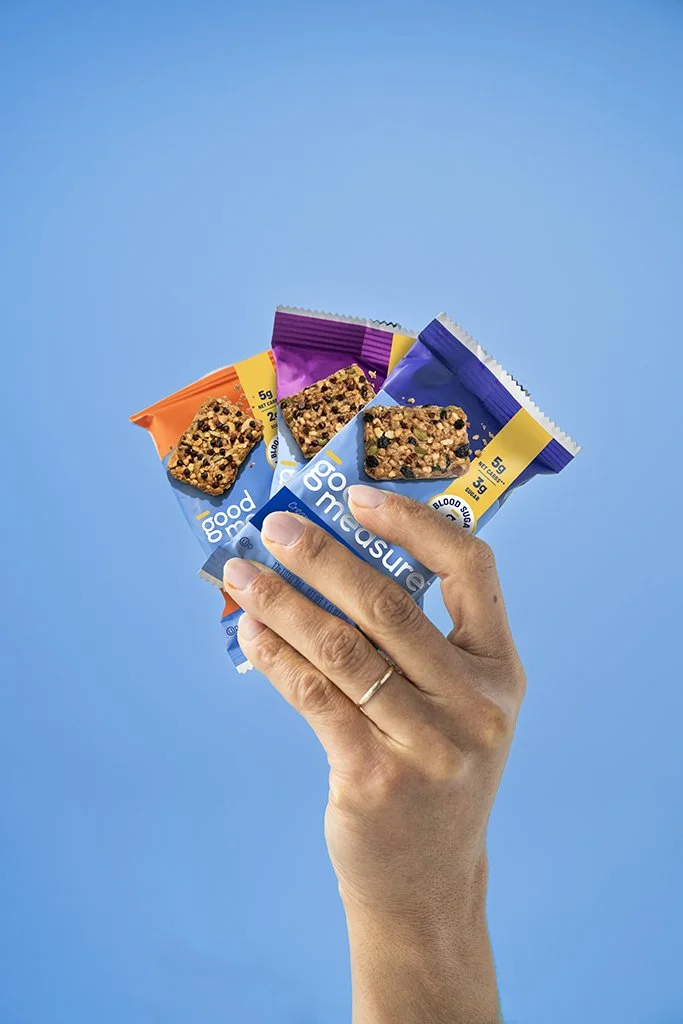

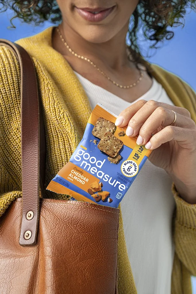
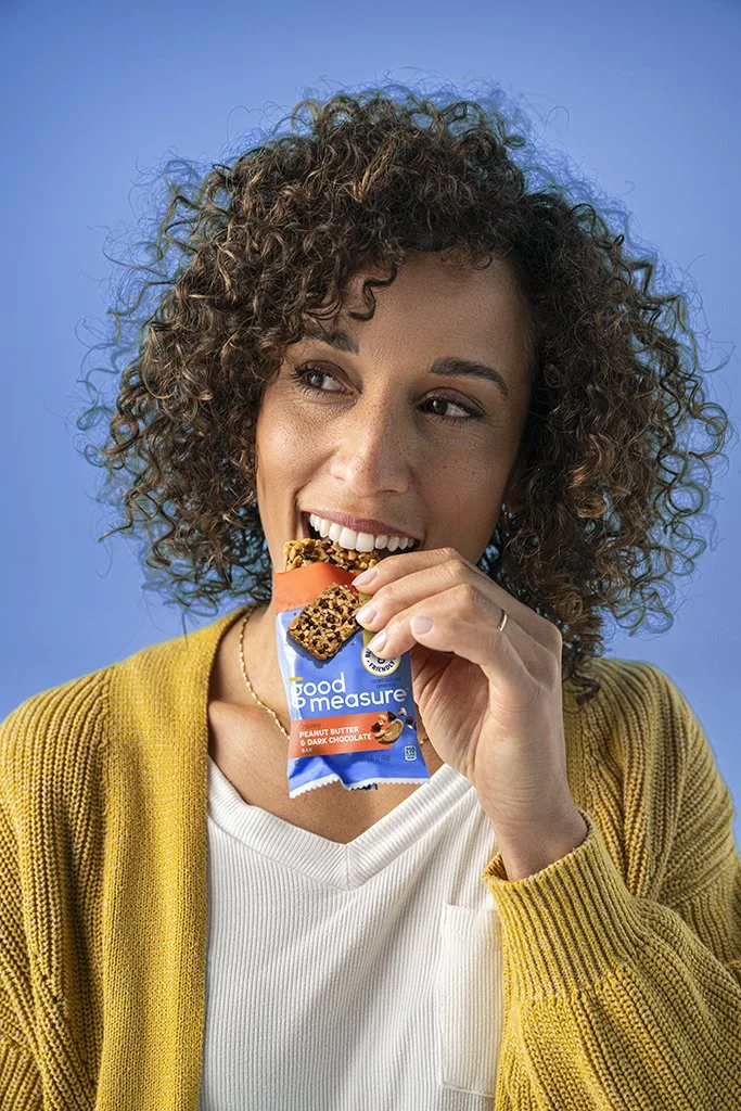
Building a brand people could recognize.
Good Measure had a compelling proposition: foods designed to have little impact on blood sugar. But while consumers responded to the benefit, the packaging wasn’t doing enough to connect that innovation back to the brand.
The challenge was to give Good Measure greater ownership without losing the functional message consumers cared about.
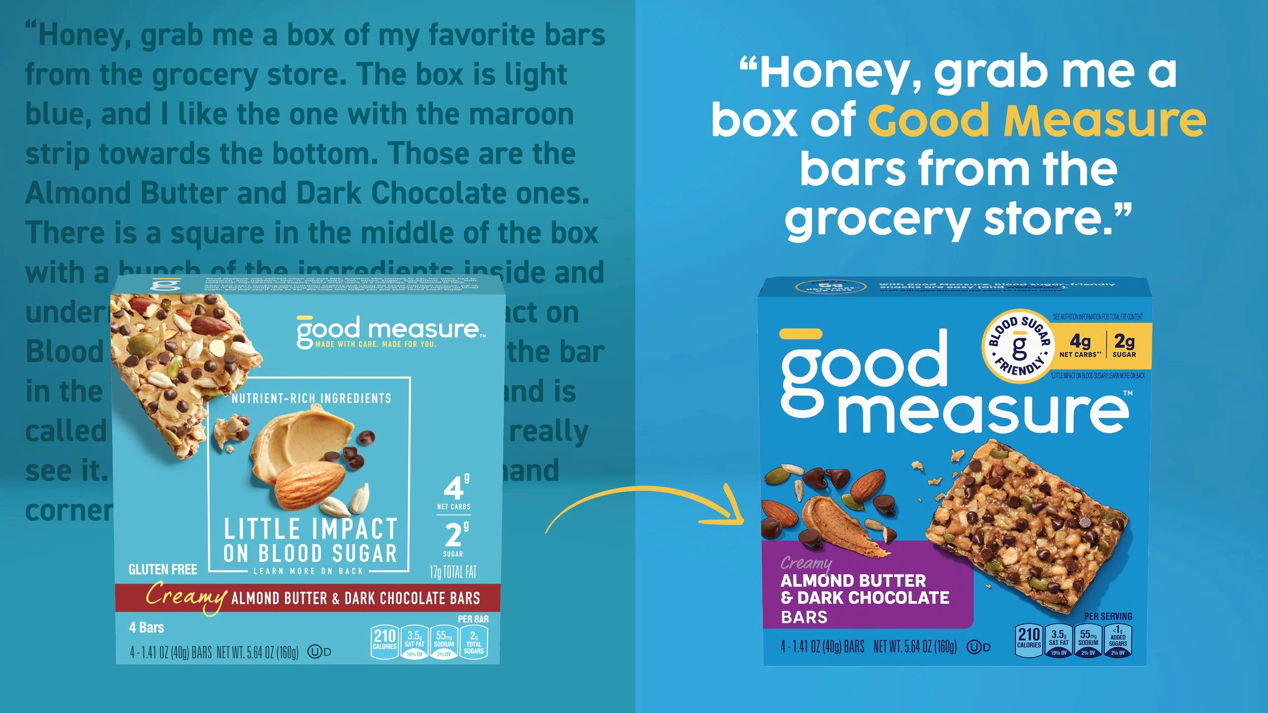
Rethinking what was worth protecting.
As the internal design lead, I partnered with our agency to guide the redesign through a multidisciplinary team. We quickly aligned on strengthening the Good Measure brand within the hierarchy. Color was a harder conversation.
The existing blue was seen as a distinctive memory cue worth protecting. I pushed us to consider whether a young brand with limited recognition should protect an existing asset—or make a bolder change to attract the trialers it needed to grow.
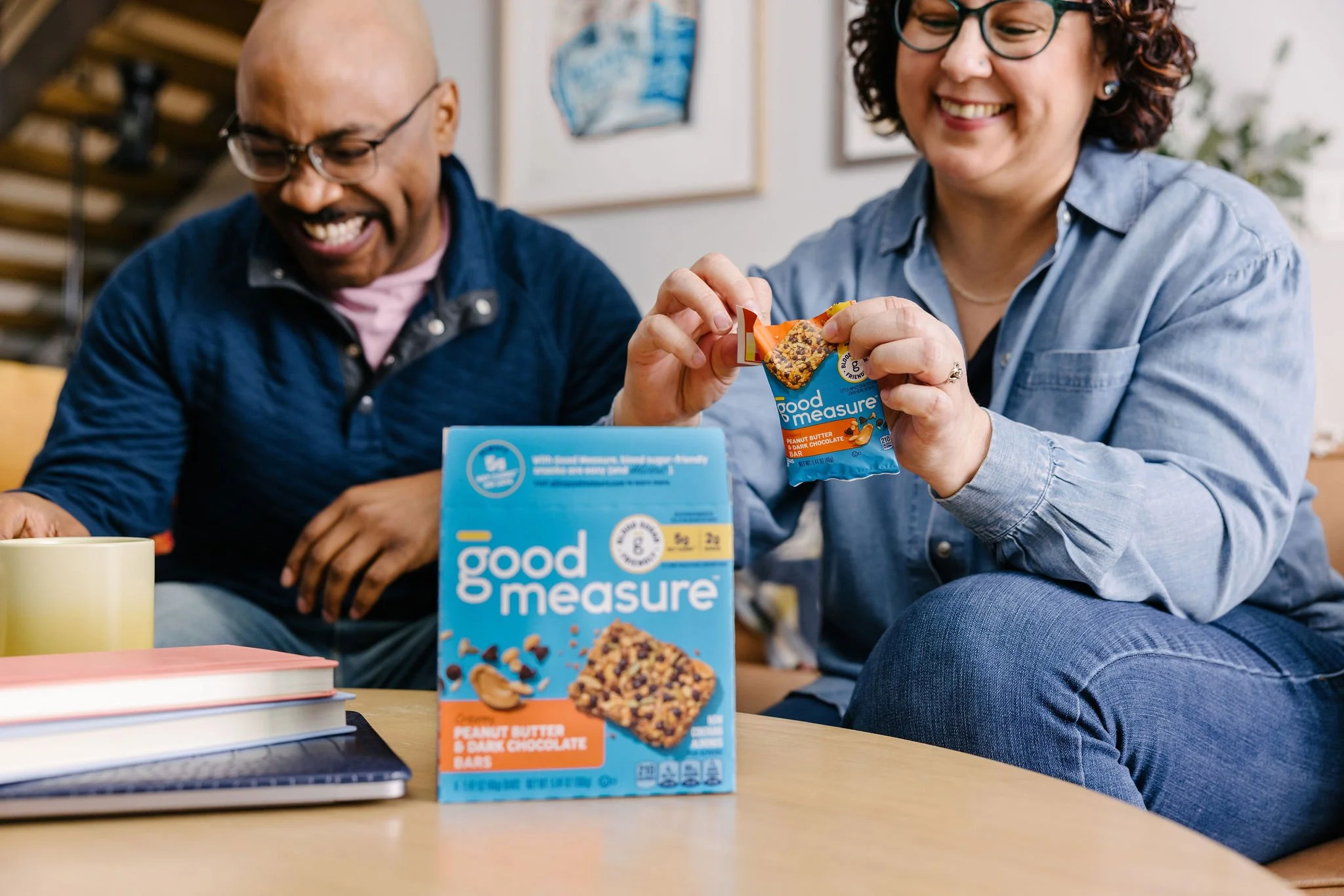
The resulting system paired a deeper, richer blue with a stronger brand hierarchy and consistent design corridor, creating packaging that felt more appetizing, recognizable, and scalable.
Making recognition measurable.
The redesigned packaging gave Good Measure a more recognizable, cohesive system built to support the brand as it grew across retail and e-commerce.
2x
+100%
BRAND AWARENESS
ON-SHELF RECOGNITION
+62%
+22%
E-COMMERCE GROWTH
RETAIL DISTRIBUTION