
Growing beyond sunscreen.
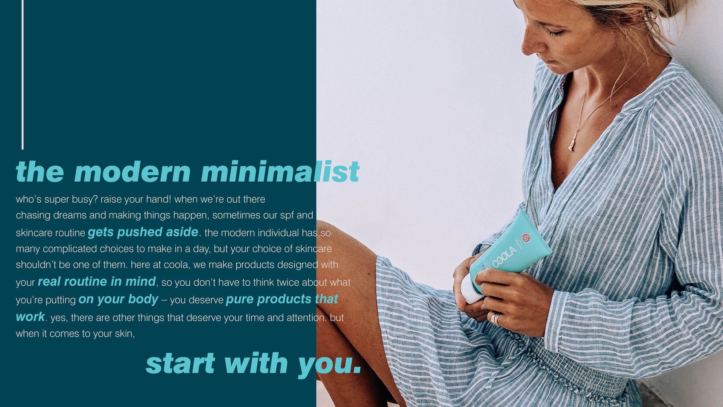
COOLA was preparing to expand its SPF roots with the launch of a new skincare collection. But while the packaging already felt clean and elevated, the broader brand expression still leaned heavily on familiar California beach cues.
The opportunity was to create a more sophisticated world about the brand – one that could support COOLA’s move into skincare, appeal to new consumers, and still feel unimstakably COOLA.
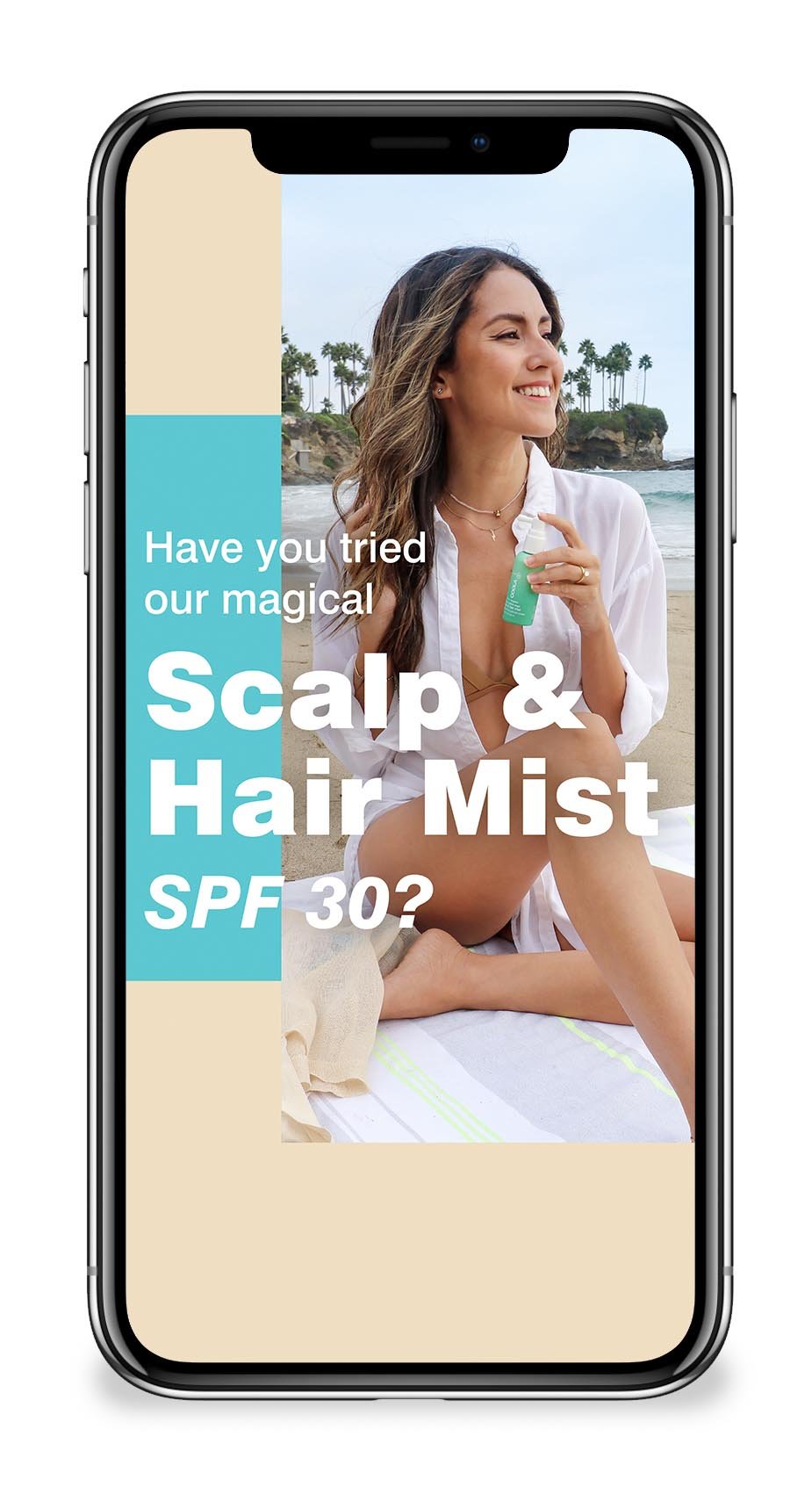
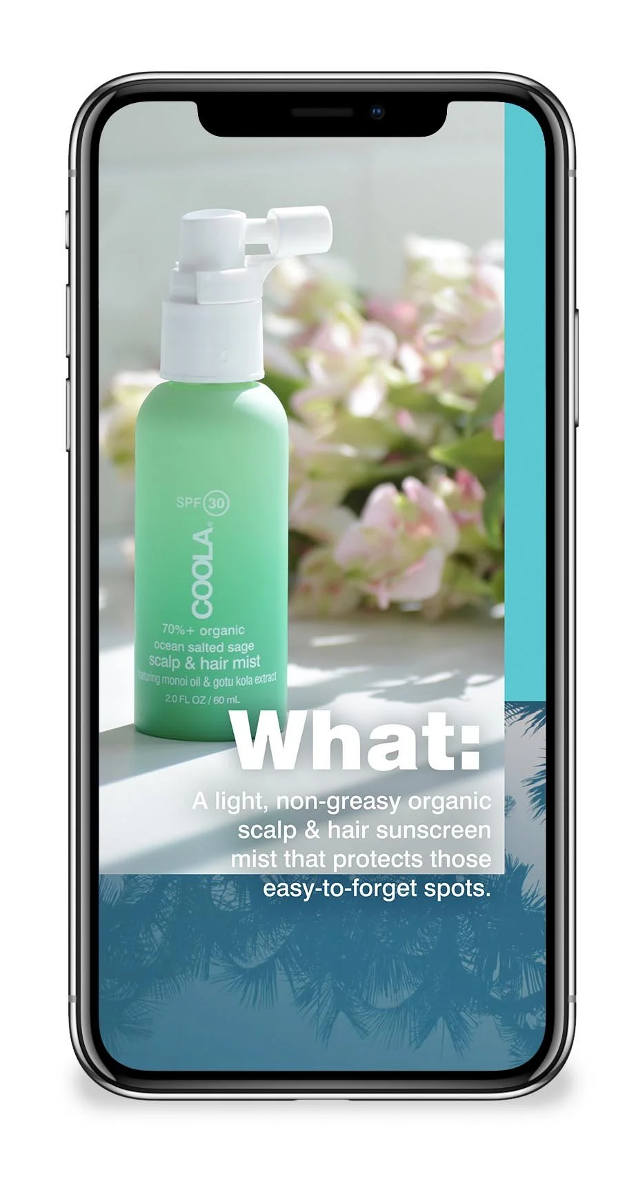
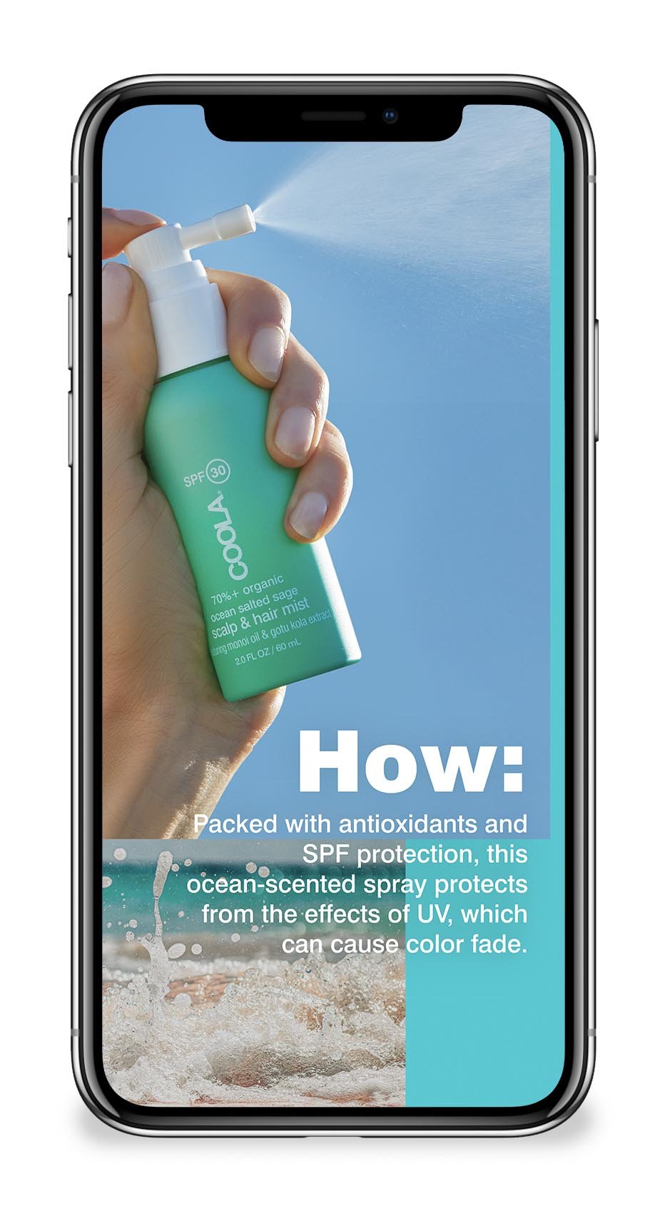
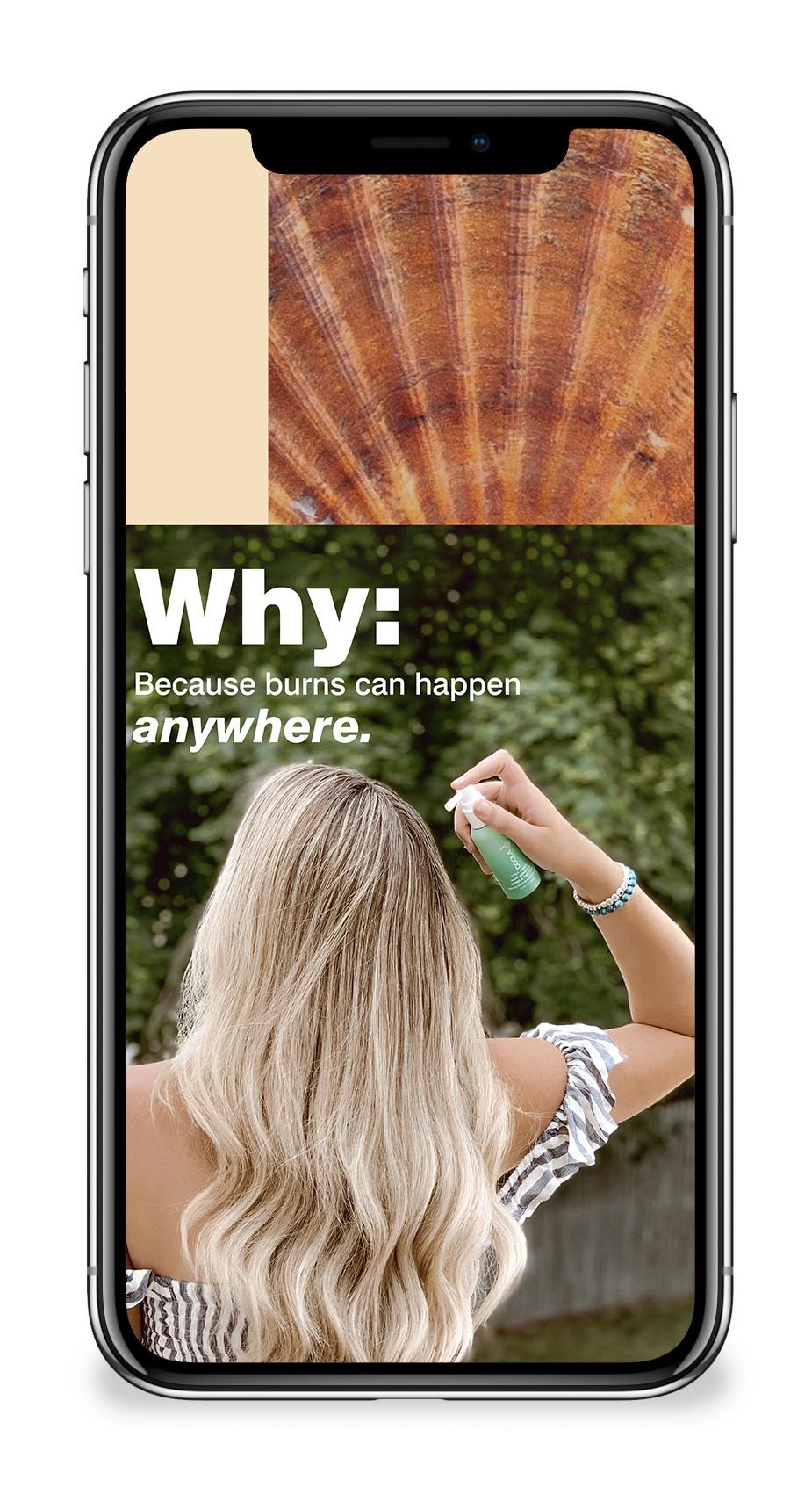
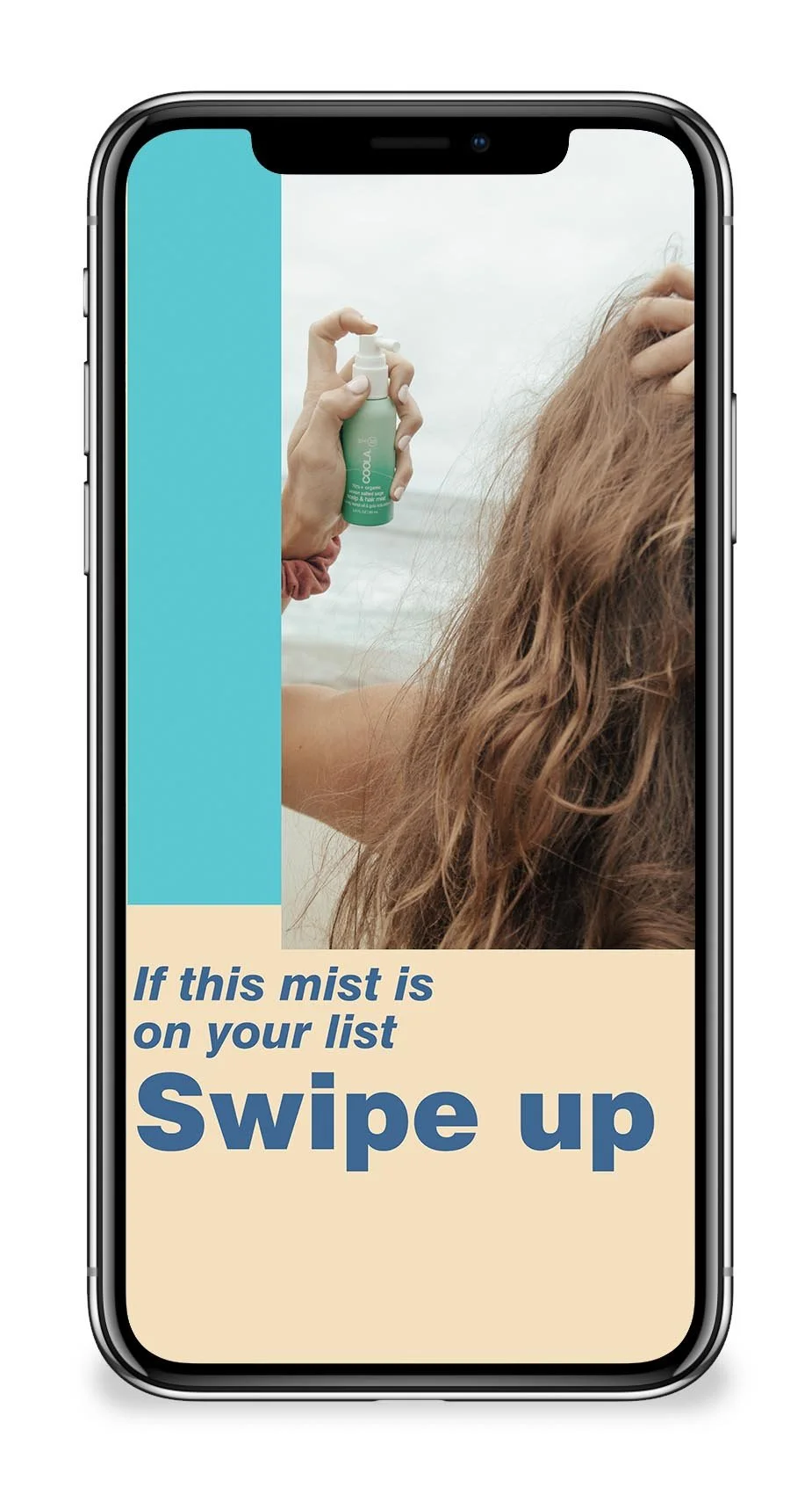
scalp mist spotlight – instagram story
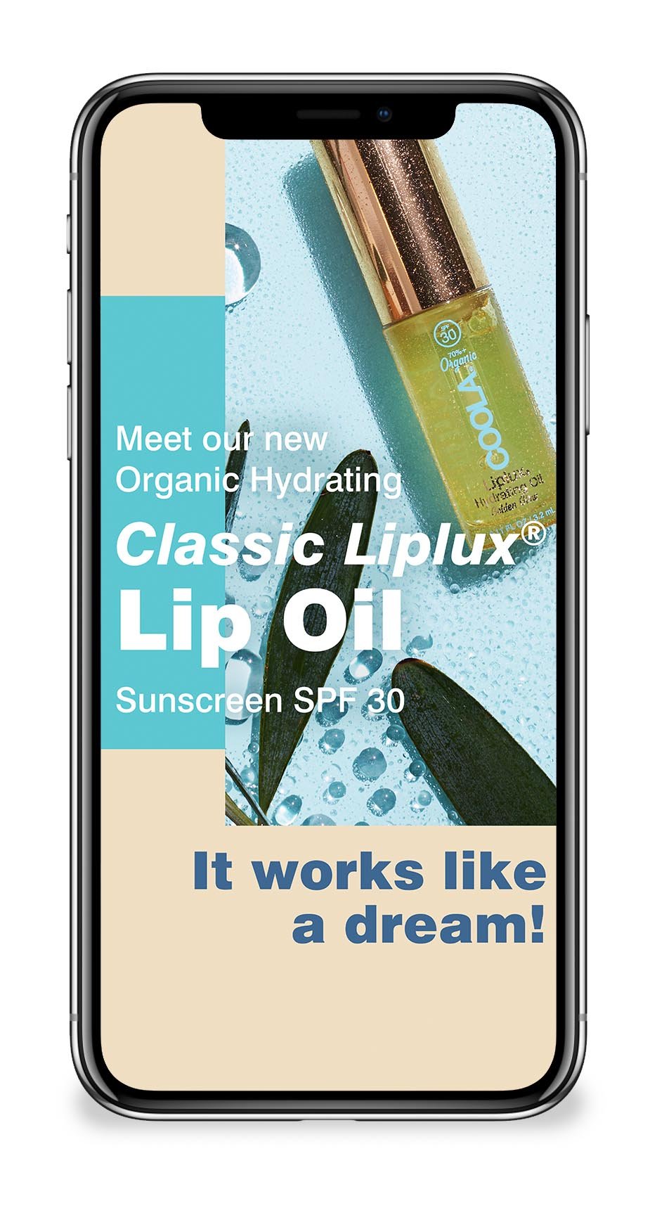
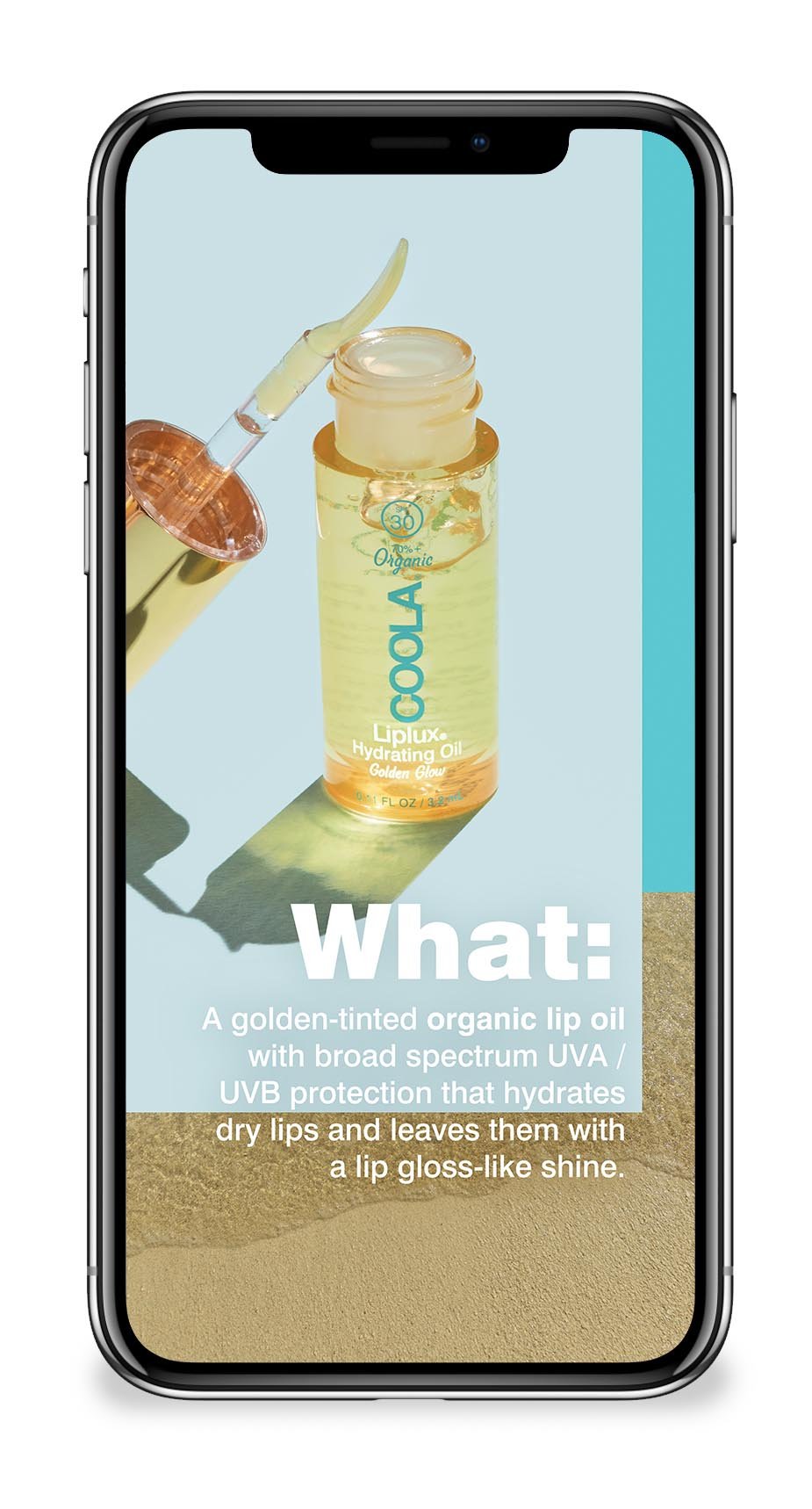
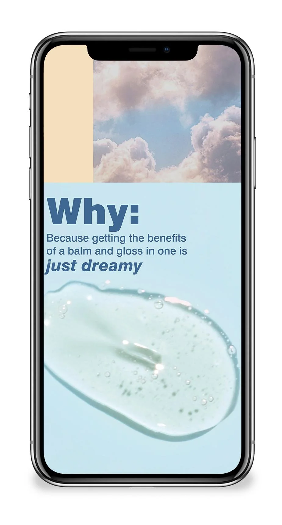
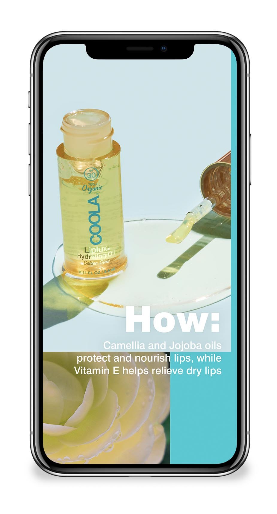
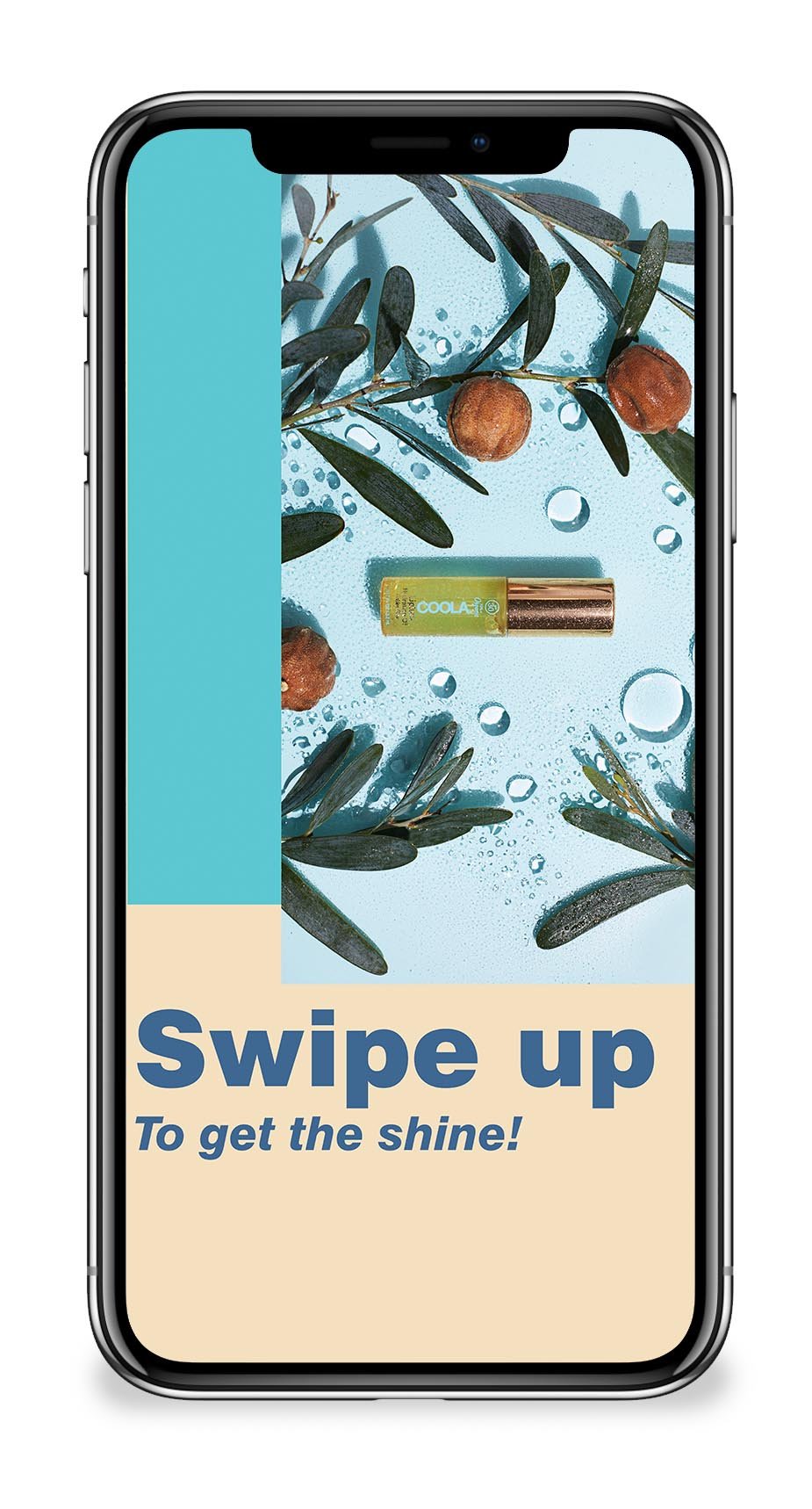
liplux oil spotlight – instagram story
Finding sophistication in restraint.
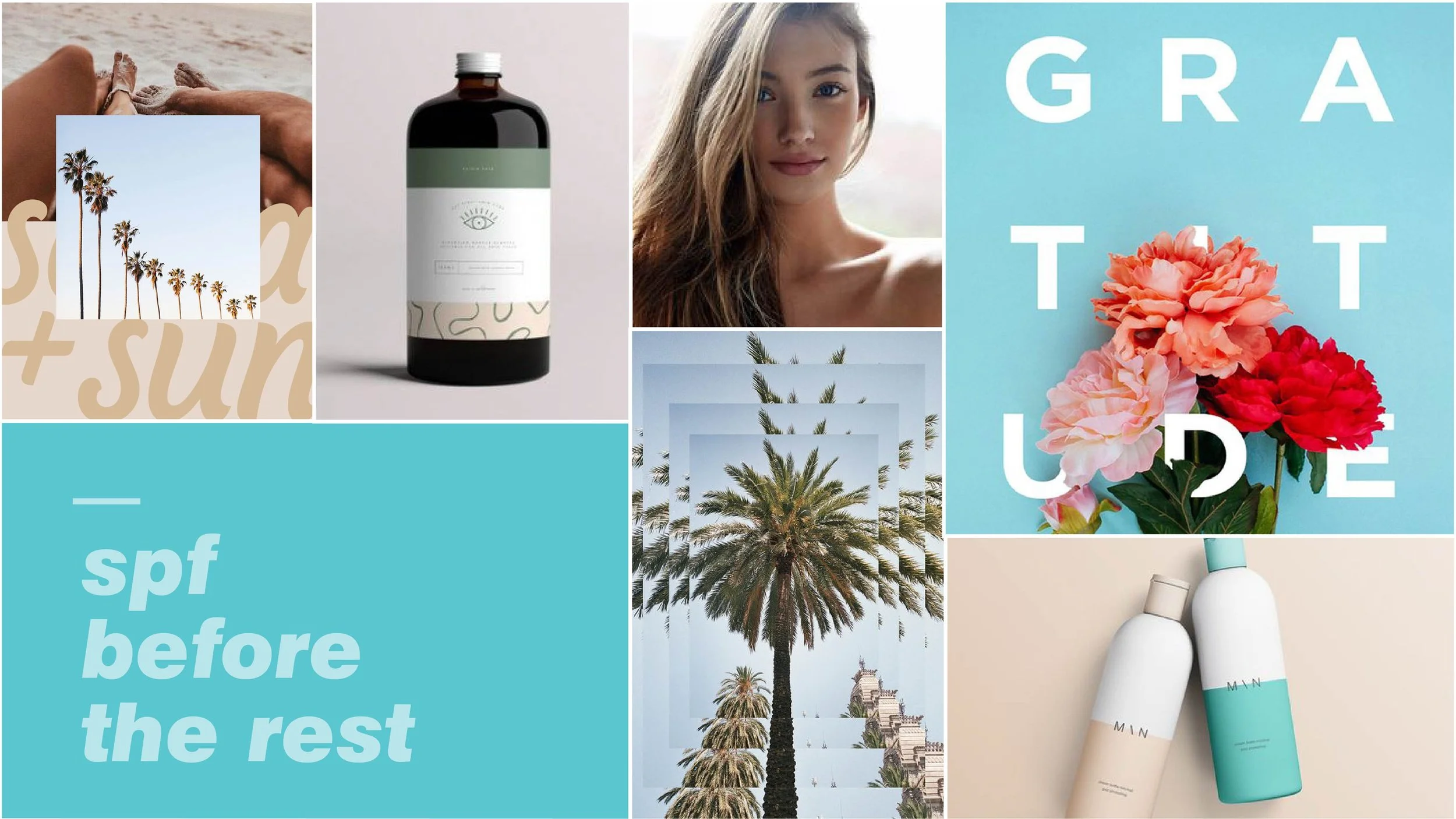
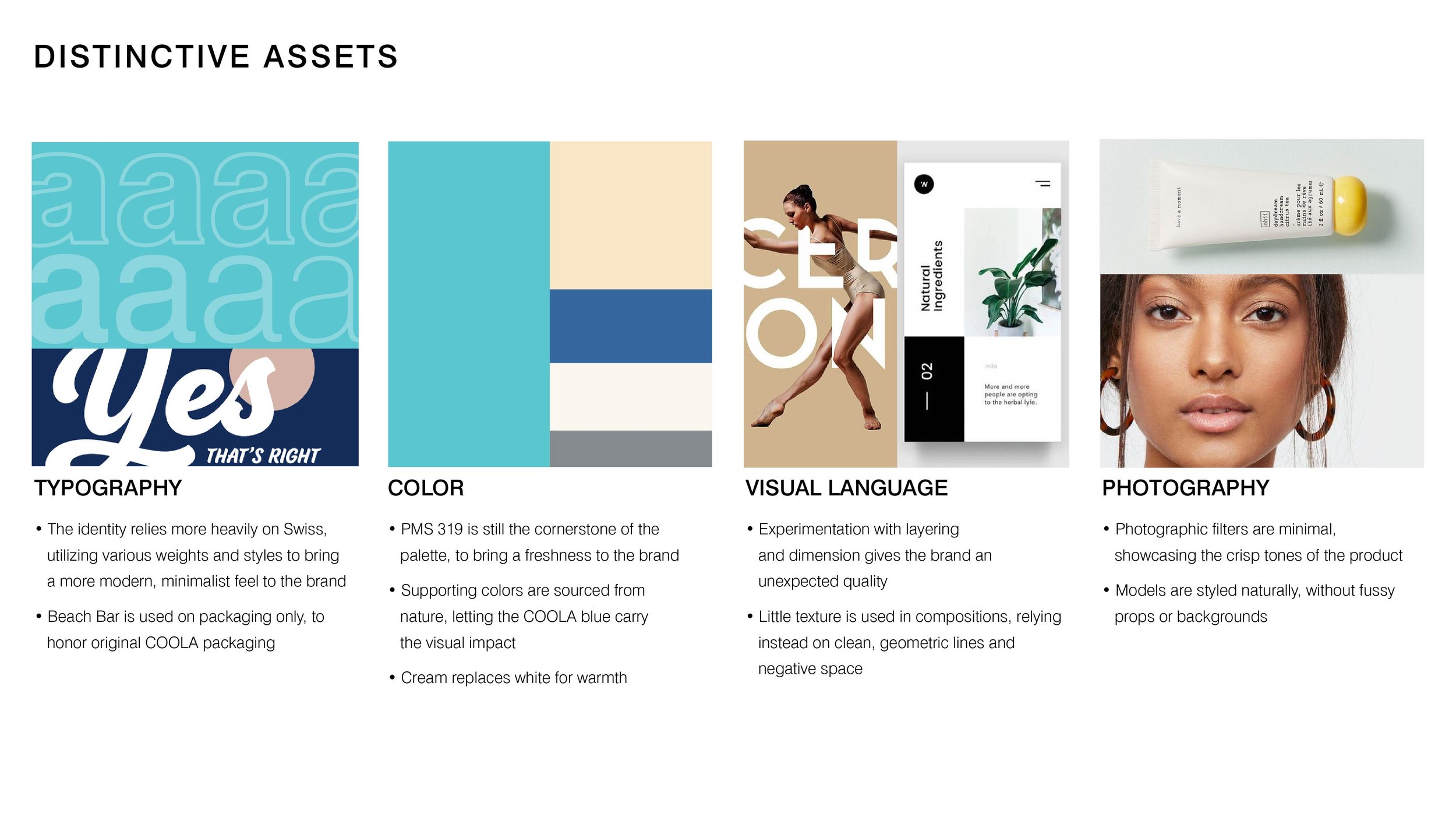
As a Senior Designer, I worked alongside our Creative Director and design team to explore what the next expression of COOLA could look like. My early explorations contributed several ideas that became part of the team’s shared direction: bold, simple typography, a broader cream and navy palette, and a more content-first approach.
Rather than relying on aqua across every touchpoint, we let COOLA’s distinctive packaging carry more of that recognition within the imagery. The surrounding system could become quieter, giving product and lifestyle content room to lead while still feeling connected to the brand.
Built to evolve.
The refresh was built around a small set of principles rather than rigid templates, giving us room to create variety without losing the larger brand expression.
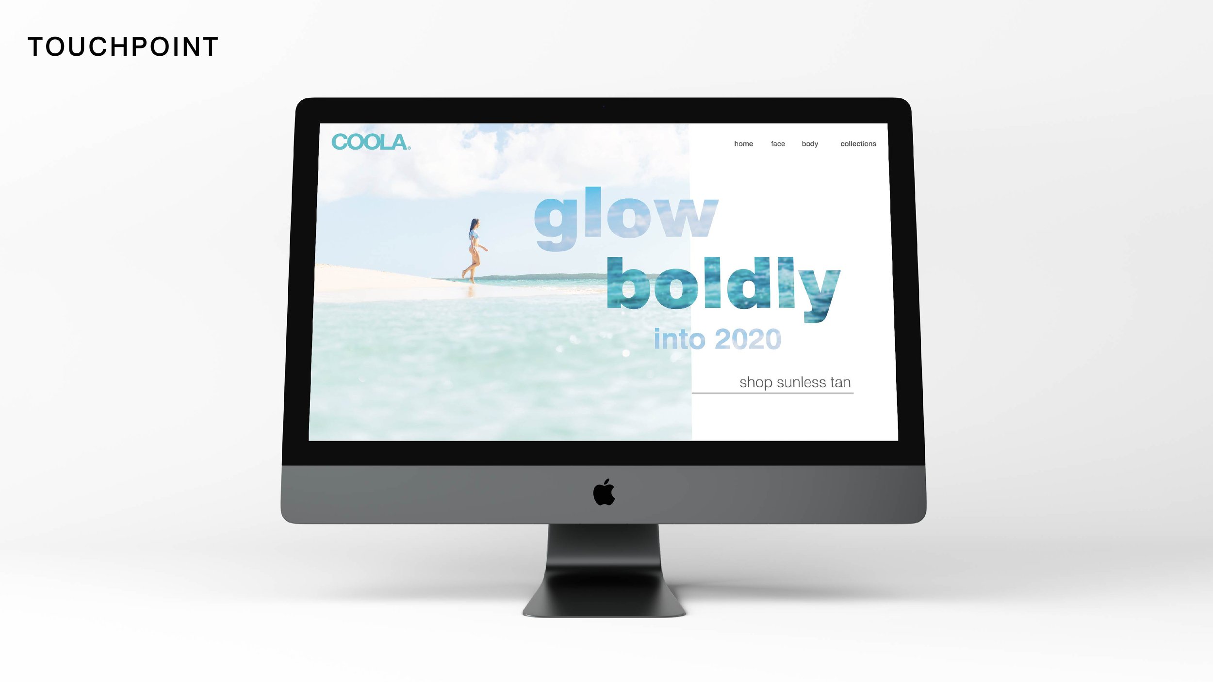
I applied the system across email, digital, print, and retail—from the new skincare launch to product education and everyday brand storytelling. The refreshed expression remained in use for roughly three to four years.

subscriber email examples