How far could Folgers stretch?
Folgers came to us with a challenge: create an elevated line of dark roast coffees for a more premium coffee consumer. But the brand brought decades of strong associations with it, and some of the equities that made Folgers instantly recognizable could also make it harder to see as specialty coffee.
As a Senior Designer at Kaleidoscope, I co-led the project with another designer, bringing our team together for a broad sketch exploration and then developing that work into distinct strategic territories. Rather than assuming every familiar Folgers cue needed to be protected, we explored how far the brand could stretch when positioning – not precedent – led the way.
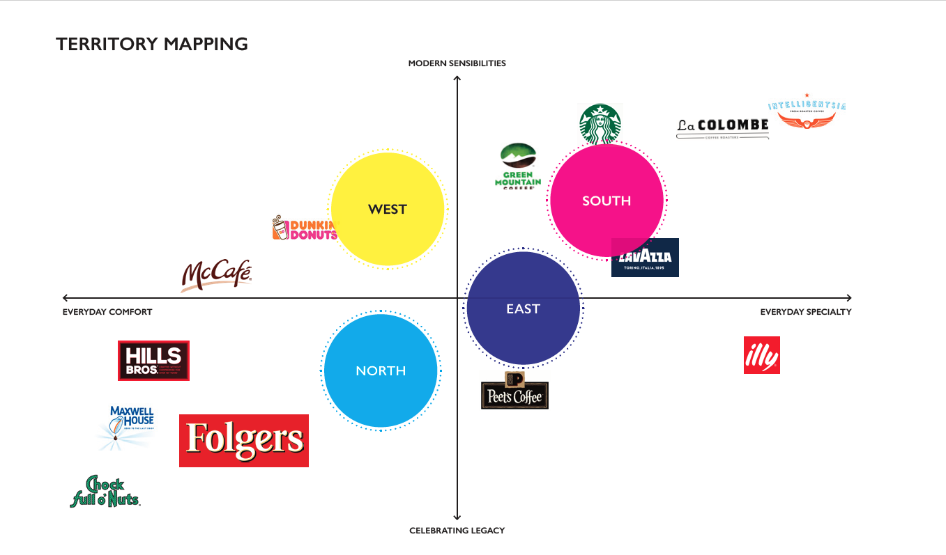

Design inspiration for Folgers Noir.

Explorations from the team sketch and the selected direction.
From sketch to system.
One sketch became an immediate standout. The core idea was unusually strong and remained remarkably intact from that first drawing through consumer testing and final design.
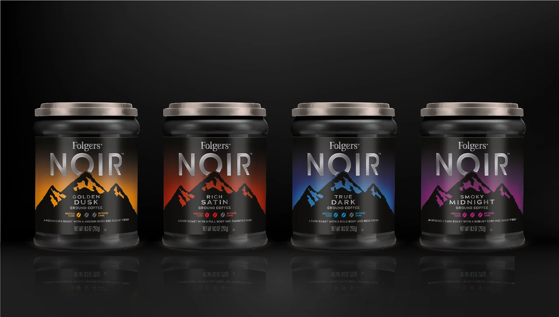
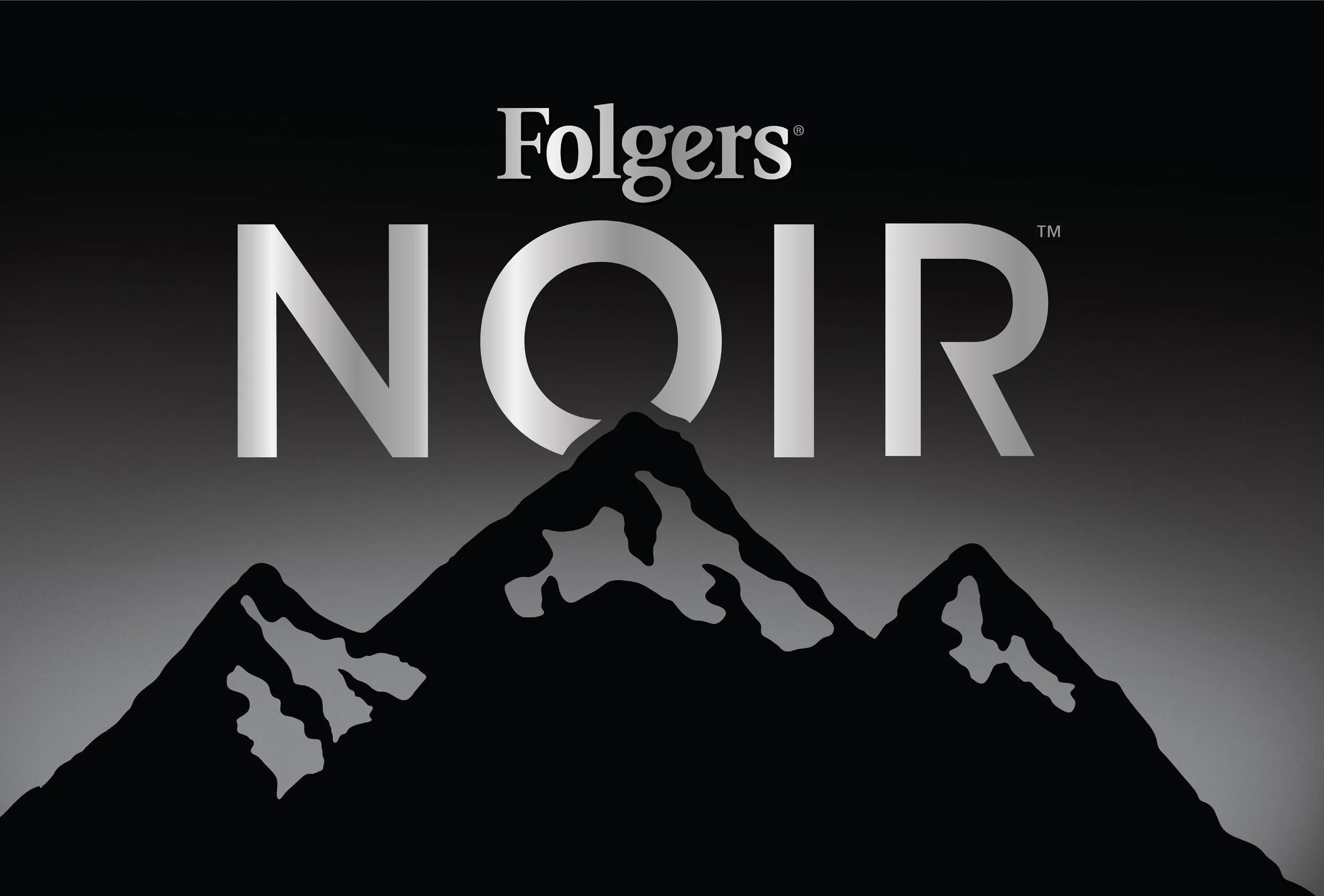
I took the selected sketch into design development, refining the typography so the O in NOIR could double as a moon within the landscape and building a versioning system for four different roast levels. Atmospheric color behind the mountains gave each variety its own character, while a simple three-bean scale made roast intensity easy to understand.
The resulting direction tested as more premium and less tethered to consumers’ existing perceptions of Folgers.

Computerized designs and the selected concept.
Making the idea real.
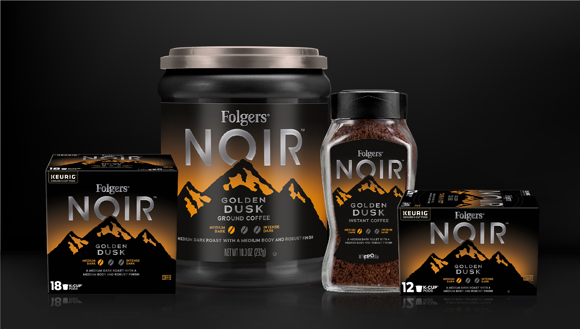
I extended the selected design across four roast varieties and multiple pack formats, building a system that could flex without losing the simplicity of the original idea.
That meant solving for production as well as design. Gradients had to reproduce without banding or haloing, metallic finishes needed to hold up in print, and the system had to remain consistent across very different package structures. I carried the work through print-ready artwork and proofing before Folgers Noir launched nationwide in 2019.